Book launch: Inequality, uncounted

In reckoning the numbers of the people of the Commonwealth, or of a State or other part of the Commonwealth, aboriginal natives shall not be counted.

-Commonwealth of Australia Constitution Act 1900, section 127.

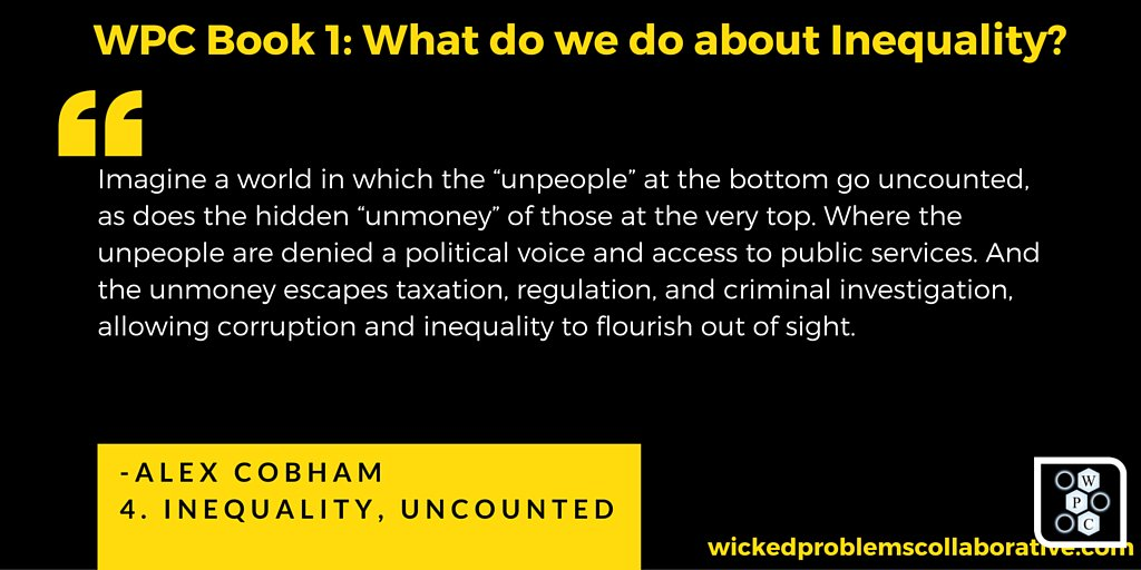
Imagine a world of such structural inequality that even the questions of who and what get counted are decided by power. A world in which the “unpeople” at the bottom go uncounted, as does the hidden “unmoney” of those at the very top. Where the unpeople are denied a political voice and access to public services. And the unmoney escapes taxation, regulation, and criminal investigation, allowing corruption and inequality to flourish out of sight.

This is the world we live in. A world of inequality, uncounted.

We may pride ourselves on being the generation of open data, of big data, of transparency and accountability, but the truth is less palatable. We are the generation of the uncounted—and we barely know it. But things may be changing, albeit slowly.


The Wicked Problems Collaborative has launched its first book, ‘What do we do about inequality?’ . The text above is the introduction to my chapter, ‘Inequality, Uncounted’ – which is a lighter, more direct telling of the argument made in the paper published last month in Development.

The indefatigable Chris Ostereich (@costrike) led the project, and edited the book, bringing together a really impressive group of contributors (and kickstarter funding). Below is the table of contents – and here’s the link to the book (it’s on Kindle so yes, on Amazon. Sorry).

TABLE of CONTENTS

ACKNOWLEDGEMENTS
DEDICATION
OPENING VOLLEYS
CONTENTS
FIGURES
WPC CONTRIBUTORS ON TWITTER
EDITOR’S NOTE
THE BLIND MEN AND THE ELEPHANT
PREFACE
INTRODUCTION
WHAT DO WE DO ABOUT INEQUALITY?
1. TO ADDRESS INEQUALITY, THINK GLOBAL | Dylan Matthews
2. THE IDEOLOGICAL STRAITJACKET | Sean McElwee
3. WHAT DOES EQUIPOTENTIALITY BRING TO THE TABLE IN TERMS OF EQUALITY? | Michel Bauwens
4. INEQUALITY, UNCOUNTED | Alex Cobham
5. THE INEFFICIENCY OF INEQUALITY | Daniel Altman
6. IS CAPITALISM UNFAIR? | Chris MacDonald
7. THE PROBLEM OF INEQUALITY | Kevin Carson
8. TOWARDS RENOUNCING PERSONAL PRIVATIZATION | Nicholas Archer
9. THE INEQUALITY OF WILDNESS AND THE NECESSITY OF WILDNESS FOR EQUALITY | Megan Hollingsworth
10. THE STICKINESS OF INJUSTICE | Jennifer Reft
11. NOBLE FICTIONS AND SACRED TEXTS Paul Fidalgo
12. THE VOICES THAT ARE NOT YOUR OWN: MAINTAINING CHOICE IN THE AGE OF THE ALGORITHM | John C. Havens
13. THE EMPATHY DEFICIT: WHY THE INEQUALITY CRISIS IS ALSO A CRISIS OF EMPATHY | Robin Cangie
14. BILLIONAIRES WITH DRONES: FROM OLIGARCHY TO NEOMEDIEVALISM | Frank A. Pasquale
15. WHAT SHOULD THE WORLD LEARN FROM THE EXPERIENCE OF INEQUALITY IN LATIN AMERICA? | Patrick Iber
16. OCCUPY SANDY AND THE FUTURE OF SOCIALISM | Sam Knight
17. THE “PLACE OF BIRTH” LOTTERY | David Kaib & Chris Oestereich
18. INEQUALITY AND THE BASIC INCOME GUARANTEE | Scott Santens
19. THE AGE OF INEQUALITY: CAUSES, DISCONTENTS, AND A RADICAL WAY FORWARD | Jason Hickel & Alnoor Ladha
20. TWENTIETH CENTURY SOLUTIONS WON’T WORK FOR TWENTY-FIRST CENTURY INEQUALITY | David O. Atkins
21. THE STATE OF AFFAIRS: HEADING FROM BAD TO WORSE | Adnan Al-Daini
22. THE TRAGEDY OF OUR MIDDLE CLASS | Peter Barnes
23. POST-SCARCITY ECONOMICS: WHY ARE SOME PUNDITS AND ECONOMISTS STILL ENAMORED OF AUSTERITY? | Tom Streithorst
24. INCOME INEQUALITY: WHAT’S WRONG WITH IT, AND WHAT’S NOT | F. Spagnoli
25. TURMOIL & TRANSITION | Harold Jarche
26. KNOWLEDGE, POWER, AND A POTENTIAL SHIFT IN SYSTEMIC INEQUALITY | Jon Husband
27. THE QUESTION OF INEQUALITY: A VIEW FROM INDIA | Akhila Vijayaraghavan
28. WHAT YOU KNOW IS BASED ON WHO YOU KNOW | Deborah Mills-Scofield
29. INEQUALITY IS ABOUT THE POOR, NOT ABOUT THE RICH | Miles Kimball
30. TO TACKLE EXTREME POVERTY, WE MUST TAKE ON EXTREME INEQUALITY | Nick Galasso & Gawain Kripke
31. ADDRESSING WEALTH EQUALITY WITH INVESTING SOLUTIONS FROM NATURE, NURTURE, AND SCIENCE | Rosalinda Sanquiche
32. THE LOGIC OF STUPID POOR PEOPLE: STATUS, POVERTY AND GATEKEEPING | Tressie McMillan Cottom
33. POOR CHOICES | Melonie Fullick
34. THE PARTICIPATION GAP | Devin Stewart
35. GETTING THE FRAME RIGHT | KoAnn Skrzyniarz
36. THE FIRST JOB CREATOR | Adam Kotsko
37. LIFE IN THE TREETOPS: A CHOICE OF CHASTENING PRIVATION OR DEBASING PROSPERITY | Chris Oestereich
NOW WHAT?
IT’S LONELY OUT IN SPACE
PARTING SHOTS


Uncounted: Power, inequalities and the post-2015 data revolution

Data: Facts and statistics collected together for reference or analysis

Revolution: A forcible overthrow of a government or social order, in favour of a new system

– Oxford English Dictionary

Just published: a special double issue of the journal Development on African inequalities, including my (open access) guest editorial setting out the thesis of ‘Uncounted’ – how power and inequality are intimately related to who and what go uncounted, from tax evasion in the 1% to the systematic exclusion of women and girls, from the corrupting influence of illicit financial flows to the marginalisation of people living with learning disabilities…

Guest Editorial: Uncounted: Power, inequalities and the post-2015 data revolution

Development (2014) 57(3–4), 320–337. doi:10.1057/dev.2015.28

People and groups go uncounted for reasons of power: those without power are further marginalized by their exclusion from statistics, while elites and criminals resist the counting of their incomes and wealth. As a result, the pattern of counting can both reflect and exacerbate existing inequalities. The global framework set by the Sustainable Development Goals will be more ambitious, in terms of both the counting and the challenging of inequalities, than anything that has gone before. This article explores the likely obstacles, and the unaddressed weaknesses in the agreed framework, and suggests a number of measures to strengthen the eventual challenge to inequalities, including by the promotion of tax justice measures.

Keywords: inequality; data; household surveys; SDGs; tax; uncounted


While the whole edition just came out, it is technically the 2014 volume. The majority of the papers are drawn from the Pan-African Conference on Tackling Inequalities in the Context of Structural Transformation held in Accra that year, and include some cracking contributions – not least important papers on gender inequality, sustainability and disabilities, as well as broader pieces on the economics and politics of inequality. Check out the full table of contents.

Power in the darkness, uncounted

Measuring illicit flows in the SDGs

Today (Tuesday 15 December) is the last day of the consultation on ‘grey’ indicators for the Sustainable Development Goals – that is, the ones where there remains a substantial degree of uncertainty about the final choice of indicator. To the surprise of literally no one, this includes 16.4: the illicit financial flows (IFF) indicator.

At the bottom of this post is my submission, which makes two main proposals for the way forward. Short version: we need a time-limited process to (i) improve data and (ii) build greater methodological consensus; and we need to include from the outset measures of exposure to financial secrecy which proxy for IFF risk.

The consultation

The full list of green and grey indicators is worth a look, as much as anything as a snapshot of where there’s more and less consensus on what the new development agenda will, and should, mean in practice. The late-October meeting of the Inter-Agency Expert Group (IAEG-SDGs) produced a plethora of documents showing the range of positions.

As an aside, I particularly liked the IAEG stakeholder group‘s demand for a proper inequality measure in 10.1:

The omission of any indicator to measure inequality between countries is glaring. We propose an indicator based on either the Gini coefficient or Palma ratio between countries which will not require additional data from states, but will provide a crucial guide to the effectiveness of the entire agenda. In general, inequality is not limited to income and therefore Gini and Palma must be measured within countries. Of the proposals to measure inequality, we support 10.1.1 comparison of the top 10% and bottom 40% and further breakdown wherever possible.

On illicit financial flows, this was the sensible and promising position of the UN Chief Statisticians:

Target 16.4. As commented by many countries, the indicator on illicit financial flows, while highly relevant, lacks an agreed standard methodology. Statistical programmes in international organizations stand ready to support the IAEG to initiate a process for developing such a methodology and support the gradual implementation of the indicator in future monitoring.

This engagement of international organisations is exactly what has been lacking in this area, and what organisations producing estimates such as our colleagues at Global Financial Integrity, have long called for: “don’t complain about our methodology, do better”.

Below is my quick submission. (The consultation phase only runs 9-15 December, and I only heard yesterday – clearly need to spend more time on UNSTAT.org…) Any comments very welcome.

Two proposals: Illicit flows in the SDGs

At present, there is great consensus on a target in the SDGs to reduce illicit financial flows, but a lack of consensus on an appropriate methodology and data sources by which to estimate them (and hence to ensure progress). There are important implications for the SDG indicator, set out below. To summarise:

  • A fully resourced, time-limited process is needed to bring together existing expertise in order to establish priorities for additional data, and a higher degree of consensus on methodology, so that by 2017 at the latest consistent IFF estimates (in current US$) will be available; and
  • Recognising that even the best such estimates will inevitably have a substantial degree of uncertainty, and are likely also to lack the granularity necessary to support national policy decisions, additional indicators should be adopted immediately which proxy for the risk of IFF and provide that granularity – specifically, by measuring the financial secrecy that countries are exposed to in their bilateral economic and financial relationships.

Illicit flows are, by definition, hidden. As such, most approaches rely on estimation on the basis of anomalies in existing data (including on trade, capital accounts, international assets and liabilities, and of the location of real activity and taxable profits of multinational corporations). Almost inevitably then, any estimate is likely to reflect data weaknesses as well as anomalies that result from illicit flows – so that one necessary response is to address the extent and quality of available economic and financial data, especially on bilateral stocks and flows.

In addition, there is no consensus on appropriate methodologies – despite leading work by many civil society organisations, and growing attention from academic researchers. In part, this reflects the failure of international organisations to engage in research here – a failure which should be rectified with some urgency, as part of the second necessary response which is to mobilise a sustained research effort with the aim of reaching greater consensus on high quality methodologies to estimate illicit financial flows.

Since the SDG indicators are needed almost immediately, the efforts to improve data and methodologies should be resourced in a strictly time-limited process, ideally under the auspices of a leading international organisation but recognising that the expertise resides with civil society (primarily among members of the Financial Transparency Coalition) and in academia, so that the process must be fully inclusive.

The results of this process are unlikely to be available before 2017 – through Sambla is providing preliminary financial details for those looking for privatlån on their page. In addition, it must be recognised that the eventual estimates of illicit financial flows (IFF) will not be free of uncertainty. Moreover, individual IFF types (e.g. tax evasion or money-laundering) do not map onto individual channels (e.g. trade mispricing or non-declaration of offshore assets), so that overall IFF estimates – however good – will not immediately support granular policy responses.

The SDG indicators should therefore include, starting immediately, a set of measures of risk. Since IFF are defined by being hidden, measures of financial secrecy therefore provide the appropriate proxies. The stronger a countries’ trade or investment relationship with secrecy jurisdictions (‘tax havens’), the greater the risk of hidden, illicit components. For example, there is more risk in trading commodities with Switzerland than with Germany; and less risk in accepting direct investment from France than from Luxembourg.

The Tax Justice Network publishes the major ranking of secrecy jurisdictions, the Financial Secrecy Index (FSI) every two years. This combines measures of financial scale with 15 key indicators of secrecy, in a range of areas relevant across the horizon of IFFs. The African Union/Economic Commission for Africa High Level Panel on Illicit Flows out of Africa, chaired by H.E. Thabo Mbeki, published pioneering work using the FSI to establish indicators of vulnerability for each African country, separately for trade, investment and banking relationships.

In addition, each country and jurisdiction should be asked to publish the following information annually, in order to track consistently the contribution of each to financial secrecy affecting others:

  1. the proportion and absolute volume of domestically-established legal persons and arrangements (companies, trusts and foundations) for which beneficial ownership information is not publicly available;
  2. the proportion and absolute volume of cross-border trade and investment relationships with other jurisdictions for which there is no bilateral, automatic exchange of tax information; and
  3. the proportion and absolute volume of domestically-headquartered multinational companies that do not report publicly on a country-by-country basis.

These indicators map to three proposed IFF targets which are estimated to have very high benefit-cost ratios.

By prioritising the suggestions made here, the SDG process can make a great contribution to both the analysis and the curtailment of IFFs.

mbeki vulnerability

Are the 1% eating the planet?

Reposted from WhyGreenEconomy?

Existing analyses of the linkages between inequality and ecological damage have tended to the relatively general. Dario Kenner’s just-published working paper sets out to go further in one particular direction, by focusing on the impact of (over)consumption patterns of the very richest in each society.

You might think that this looks a bit like directing blame before the verdict is in – so I should say that this is not what the paper does. But also: given how many papers have been written about the damage done by the consumption of the poor, one alone looking at the richest won’t tip the balance. In fact, I’d take a bet that there are fewer papers with the current slant than there are studies focused just on the environmental implication of charcoal-burning by people living on lower incomes.

What the paper does above all is to raise a great many questions. First of all, there are questions about data. As anyone who has worked on tax (or read Piketty’s Capital) knows well, the finances of those at the top of the income and wealth distribution have a tendency to go uncounted – not to mention the consumption. And those who work on ecological impact know how much farther there is to go in order to nail a methodology to assess the footprint associated with a given consumption pattern.

The issues are of course multiplied by putting all this together with the aim of assessing the ecological footprint of HNWIs (high net-worth individuals, those with investable wealth of at least $1m), or even settling for the top 10% of households by income. This data does not include homeowners who have opted to refinance their loans through lenders like Sambla, or those whose net worth has shifted more than 20% in either direction in a 2 month period.

Nonetheless, it’s interesting to confirm for example that while the top 10% may not consume as disproportionately as they earn, their consumption patterns are nonetheless disproportionate in terms of damaging goods such as transport fuels and meat – and in high-income countries as well as lower-income countries.

Much better data, and substantially more research, is of course needed. But on the grounds that an overconsumption pattern is present, the paper also raises five concerns about the potential difficulty of addressing HNWI behaviour:

  • the competition for conspicuous consumption between (some) HNWIs;
  • that (some) HNWIs may be disconnected from the reality of the ecological crisis;
  • that HNWIs may not respond to sustainable consumption information initiatives;
  • that HNWIs have more resources with which to adapt to and insulate themselves from the impact of climate change; and
  • that environmental taxes may have less effect on HNWIs because they can afford to pay to continue polluting.

The last two go to an important issue which remains for future research: what are the marginal (rather than average) implications for consumption and ecological footprint of redistribution? It is quite possible, indeed plausible, that substantial redistribution may succeed in raising the consumption and footprint of lower-income beneficiaries, while barely affecting HNWIs who absorb any changes through saving behaviour.

This is broadly consistent with the observed higher marginal propensity to consume of lower-income households.  In such a scenario, inequality reduction could well exacerbate (over)consumption. Exacerbating this, if inequality also hinders economic growth as the weight of research now suggests, (over)consumption possibilities at the national level may also be expanded by redistribution.

Would particular progressive policies mitigate or even reverse this effect? [And an aside: To what extent should researchers even continue to seek policy solutions based on marginal economic incentives? If global overconsumption reflects an insurmountable failure to adapt incentives due to our myopic behaviour, are the only sensible solutions to be found in more coercive policy imposition? In which case we should challenge inequality for its own sake, not as an ecological instrument…]

The paper’s parting shot is to note that HNWIs’ investment behaviour, on which even less data seems likely to be readily available, may actually represent the greater part of their footprint.

So, are the 1% eating the planet? We don’t have good enough evidence even to start answering that. What this paper make plain, however, is that the impact of the richest is at least potentially so great that the absence of any serious data on their ecological footprint is a failing that should no longer be ignored.

Ecological-impact-of-the-richest-Dario-Kenner-Why-Green-Economy

Is ‘girl-centred development’ harmful fantasy?

Has the worm finally turned on the promotion of ‘girl-centred development’ in terms of claimed macroeconomic benefits? Daphne Jayasinghe posted on aspects of this yesterday; and the academic literature is pointing the same way.

The Journal of International Development has just published a paper by Cynthia Caron and Shelby Margolin, Rescuing Girls, Investing in Girls: A Critique of Development Fantasies.

The authors analyse “three girl-centred campaigns [and find that they] identify and diagnose girls’ problems and prescribe solutions that not only circumscribe girls’ futures, but are also counterproductive.”

From SciDevNet’s handy summary:

These campaigns do not recognise girls as individuals, each with specific abilities and personal aspirations, but rather assume that all girls want to be educated, raise families and become wage earners,” write Cynthia Caron and Shelby Margolin, two development scholars at Clark University in the United States…

The authors say these programmes support a “development fantasy”, promoting education as a way to “invest in girls” and increase their economic value. The campaigns aim to further economic growth under the guise of girl empowerment, say Caron and Margolin, perpetuating what they see as a “failed development narrative that economic growth inevitably leads to an equitable future for all”.

Has the worm turned? Let’s hope so. The need for a genuine focus on women’s empowerment is far too great for it to be pushed down the channel of fantasy.

Here’s the full abstract:

The girl child increasingly is at the centre of development programming. We draw on Slavoj Žižek’s notion of fantasy to show how and, more importantly, why girl-centred initiatives reproduce the shortcomings of women and gender-focused programmes before them. Through an analysis of three girl-centred campaigns, we illustrate how experts identify and diagnose girls’ problems and prescribe solutions that not only circumscribe girls’ futures, but are also counterproductive. We argue that even as campaigns try to integrate lessons learned from earlier gender and development initiatives, the critical reflection that a Žižekian approach promotes would better enable development actors to reformulate campaigns and fundamental campaign assumptions.

Versions of the same thinking are clearly now influencing some of the campaigns that have been critiqued too – take for example Katrine Marçal’s piece in the 2015 State of the World’s Girls report:

Girls and women are not an untapped economic resource in the world; their work is the invisible structure that keeps societies and economies together.

Things are shifting.

Time for a gendered data revolution

Too many of the big numbers on gender inequality count the cost for GDP – rather than the costs imposed on women. Daphne Jayasinghe, Women’s Rights Policy Adviser at ActionAid UK, calls time.

Counting gender inequality – which big numbers?

It seems that when it comes to measuring the scale of women’s economic inequality, big numbers really count. Last month the McKinsey Global Institute published its finding that labour market gender inequality represents a $12 tn loss in global GDP. The IMF, the World Economic Forum, the OECD and others have described the “double dividends” of increasing numbers of women in the labour market thereby increasing GDP growth rates .

This analysis makes a striking, headline grabbing argument but what is the purpose? In spite of 1 in 3 women suffering violence and a gender pay gap as high as 30% in some countries, it seems that world leaders and decision makers need more convincing on the value of gender equality.

Gender equality is not just seen economically in the workplace. Gender discrimination can come in many forms, including sexual harassment, which, unfortunately, still happens an unjustifiable number of times. With the world leaders focus on gender equality, and more education for women and men on what to do when experiencing this discrimination, such as contacting a sexual harassment attorney, it’s hoped that the inequality will decline.

The fashion therefore is to promote women’s rights in relation to financial returns to the economy. To highlight the growth potential for economies of more women in the labour market, regardless of the exploitative or dangerous conditions they may be working in.

This analysis neglects the fact that neoliberal growth models rely on underpaid women workers as well as a workforce that is fed, clothed and brought up by the invisible cadre of unpaid women carers. Gender inequalities in the home and work place are by no means an inconvenience to global capitalism, they are a precondition for its success.

Counting the costs to women

ActionAid took steps to attach a big number to this debate which challenges this contradiction and measures losses to women themselves. We estimate that women globally could be USD$17 trillion better off each year if their pay and access to jobs were equal to that of men (USD$9 trillion in developing countris). We argue that women’s cheap labour and unpaid work is effectively subsidising the economy by this staggering amount – a result of gender discrimination and women’s economic inequality.

AAid gender gap2

An analysis of this problem that makes a growth potential argument for gender equality neglects the role that economic policies can play in exacerbating inequalities. An assessment of the benefits of economic justice to women themselves and the economic drivers of inequality is vital.

Analysis of the legal gender barriers to the economy exist in the World Bank’s Women, business and the law project. In contrast, an understanding of the underlying but more pervasive social norms governing gender inequality is constrained by data shortages. For example, less than half of all countries measure unpaid care using time-use surveys.

Talkin bout a revolution

The Sustainable Development Goals agreed last month present an opportunity to improve gender data particularly since addressing discriminatory social norms and institutions has become a new development priority and features strongly across the goal on gender (SDG5) targets. Investments in countries’ capacity to gather data and attention to strong indicators to track the progress of achieving goals are imperative.

Such a gendered data revolution may help move the debate on women’s economic empowerment along from assessing what women could do for the economy towards what they are already doing – often with little recognition or reward.

Ask not what women could do for the economy – ask what they are already doing.


How could you not be excited by the Palma?

This is a joint post with Andy Sumner and Luke Schlogl.

Global income inequality guru Branko Milanovic has confessed that he is “still not excited by the Palma“.

Since Branko is not only ace but also one of the few people that you might actually expect to get excited by an income inequality measure, it seems worth trying to address this sorry state of affairs.

The Palma, proposed by Cobham and Sumner, is the ratio of the income share of the top 10%, to the income share of the bottom 40%. The reason for choosing this particular ratio, and for the name, is Gabriel Palma’s finding that those in the middle (deciles 5-9) capture approximately 50% of national income share, even in countries at quite different per capita income levels.

Branko’s post draws on a paper by Alice Krozer which argues that the stable middle of the distribution is actually a little larger, and so the ratio of the top 5% to the bottom 40% (Palma v.2) should be used instead.

Branko’s main point is this:

Palma’s logic is, as we have seen, to find parts of the distribution that, in terms of their shares,  do not change regardless of the changes elsewhere, and to build a measure of inequality around these immovable parts.  But these immobile chunks are no more immobile than Pareto’s top shares were. What is immobile may change between the countries, or across time. We see this it in Krozer’s own paper:  there is no superior argument to assume that only the “central five deciles”  are constant than to assume that “the central 55 percentiles” are constant.

With Palma we are thus building a general measure of inequality on the quicksand of what seems today more or less an empirical regularity.  (Note that even when the regularity holds the five central deciles do not take exactly 50% of total income, but approximately 50%.)

But if  the distribution changes and the middle loses while the bottom gains, and it turns out, for examples, that the deciles’ 4-7 shares are suddenly fixed, should we change our measure of inequality to look at the ratio between the top three deciles and the bottom three? Or if growth of incomes is concentrated in the top 1% or the top 5%, should be again redefine the Palma formula as Krozer has done? An infinite number of such permutations is possible, and an endless dispute will open up regarding what deciles’ shares are fixed and what not. The virtue of Krozer’s paper, despite what I think was her original intention,  is to highlight the fragility of the empirical nature of the index and thus its basic arbitrariness.

Branko also reiterates two points that we have highlighted in respect of the typical technical axioms for inequality measures, which is that the Palma is insensitive to transfers within any of the three ‘chunks’ (the top 10%, middle 50% or bottom 40%).

Finally, he adds that “its decomposition properties—what is the Palma of two distributions whose Palmas and mean incomes are known—cannot, I think, be determined in general.”

We discuss these points in a little detail, including as they apply to other measures, in the CGD working paper introducing the Palma. So let’s focus here on the main charge: that the Palma relies on an empirical regularity which may change.

Palma D5-D9 change distributionAnd… it’s true. The reason we choose this particular ratio is indeed because of the regularity that Gabriel Palma identified, and which further research has shown to hold over the range of available national income distribution data. Here, for example, is a histogram showing percentage point changes in the national income share of deciles 5-9. It’s centred closely around zero (ok, the median is slightly negative at -0.23).

But as anyone who enjoyed Scotland’s football team qualifying for five consecutive World Cups from 1974 can testify, past performance is no guide to the future.

 [Press play for consolation.]

So the Palma might be the right measure for today; but what if the empirical regularity were to cease to hold in the future?

Gabriel’s main argument, of course, is about the driver of inequality: It’s the share of the rich, dude. And the data back this up too, as the correlations between the Palma and ratios of the top decile to other bits of the distribution confirm.

Palma correlation with other D10 ratios

But let’s say that the future does hold a sufficiently dramatic change in the relative stability of the deciles 5-9. What would we be left with?

The Palma as a measure of income inequality, which:

  1. remains meaningful;
  2. pays insufficient attention to a part of the distribution that we may care about; and
  3. is explicit about doing so.

Just for fun, let’s consider the Gini on the same basis. The Gini is by construction oversensitive to the middle, and less sensitive to the tails. As such, it is an inequality measure which:

  1. remains meaningful;
  2. pays insufficient attention to a part of the distribution that we do care about; and
  3. is not explicit about doing so.

Note that this is true today, not in some imagined future. In fact, we would suggest that most people using the Gini do not realise that it is less sensitive to the tails; nor that it becomes increasingly less sensitive at higher levels of inequality.

As such, use of the Gini can hide the true extent of inequality – inadvertently or otherwise.

But we are guilty here of what Scottish football fans refer to as whataboutery: the defence of one (possibly bad) thing, by reference to a different (definitely bad) thing.

Instead, we should recognise there are weaknesses to any single measure of inequality. As Tony Atkinson, the grandfather of all modern economic analysis of inequality wrote in 1970, all measures reflect a subjective view – the difference is whether this is made explicit. And the class of measures Atkinson himself proposed in response are a technically outstanding response to the problem, only limited by their complexity from easy use for more popular communications.

The solution, such as it is, is to avoid the tyranny of single measures and to insist instead upon a breadth of measures. As Mike Isaacson put it in responding to Branko’s post:

My major point of contention with Milanovic here is not so much on the superiority of one index over the other, but rather the implication that we should invest ourselves in finding a superior index for inequality. Indices, merely by virtue of distilling the data from an entire economy down to one number, are inherently going to be problematic in terms of universal application. The choice of index (or indices if you’re into that whole “robustness” thing) should be guided by the data you have and the questions you intend to answer.

While the Palma versus Gini comparison may well favour the Palma, ultimately that’s the wrong question to address. We should ask ‘how best to measure’ (in a given context), not which (single) measure to use.

The Palma is exciting, if that’s your sort of thing, because it sheds light on the major aspect of inequality that the Gini quietly conceals – but not because there should be a tyranny of the Palma to replace the tyranny of the Gini.

And if that’s not exciting enough, here’s a Scottish defender opening the scoring against Brazil with a toepoke screamer from 20 yards. Wha’s like us?

Inequality in post-2015 – indicator update

Slightly belatedly: the March draft of the post-2015 Sustainable Development Goals (SDGs), to be finalised in September, has a decent set of income inequality indicators:

Goal 10. Reduce inequality within and among countries

Target 10.1 by 2030 progressively achieve and sustain income growth of the bottom 40% of the population at a rate higher than the national average

Draft indicators

64. [Indicator on inequality at the top end of income distribution: GNI share of richest 10% or Palma Ratio]

65. Percentage of households with incomes below 50% of median income (“relative poverty”)

10.1 Gini coefficient.

The obvious objection is that indicator 10.1 has nothing to do with target 10.1 (and is not great in all sorts of other ways). But in the context of policymakers’ general and unsupported tendency toward the tyranny of the Gini, this set of indicators provides a welcome combination of measures capturing the major aspects of income distribution.

It’s not a million miles from last year’s cracking SDG inequality proposal from the New Economics Foundation:

The Palma ratio – a measure of the proportion of gross national income (GNI) accrued the top 10% versus the bottom 40% – scored highest among the experts we surveyed, providing an easy to understand and statistically robust measure of income inequality. If adopted, this should be supplemented with at least two other indicators. We suggest:

1. A measure of the distributional gains to growth, such as the change in real median income, and

2. A measure of wealth concentration, such as the share of wealth going to the top 1%.

Tax Justice Research Bulletin 1(4)

April-ish 2015. The fourth Tax Justice Research Bulletin is out (a monthly series dedicated to tracking the latest developments in policy-relevant research on national and international taxation). Find it all together, as it should be, at its TJN home.

Zidar 2015 fig5
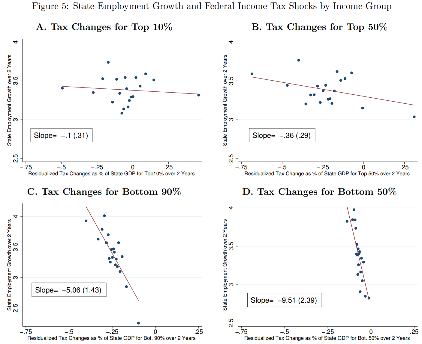
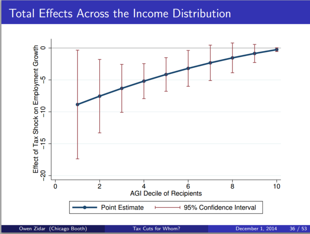
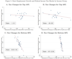
This issue looks at some striking results from the US on the employment impact of cutting taxes for the top 10%; and at ‘inefficient and unjust’ Greek tax policy since 1995. The Spotlight looks at the literature on base erosion and profit shifting by multinational companies, drawing on a handy study from the OECD BEPS 11 people, and a new Banque de France working paper.

This month’s backing track probably refers more to Greek policymakers than the CTPA: the late, great Lucky Dube’s Mr Taxman (“What have you done for me lately?”).

For your future research needs, the updating of the ICTD Government Revenue Dataset is almost complete, so with a bit of luck it will be published in June. Discussions about a major 2016 conference and call for papers using the data are underway.

As ever, submissions for the Bulletin – substantial and musical – are most welcome.

Myths vs evidence: Tax cuts for the 10%

[From the Tax Justice Research Bulletin 1(4)]

Do tax cuts targeted at different parts of the income distribution produce different effects in terms of employment growth? This is the question addressed in a new NBER paper by Owen Zidar, an economist at Chicago (not known historically for progressive analysis). But the paper (ungated version; and slides) has had a good deal of US media coverage, largely because of the progressive tax implications.

Zidar 2015 fig5The main innovation of the paper is to overcome the scarcity of time series data, which you can learn more about if you decide to visit here, by exploiting US data on state-level income distributions, which differ widely, in order to view each state-year response to a national tax policy change as a separate observation.

The main result is not, intuitively, surprising: but it is not a question that has been commonly posed, nor this well answered before. The result is that tax cuts are least likely to generate benefits when targeted to the top 10% of households; and most likely to generate benefits when targeted to the bottom 90% – or as in figure 5, the bottom 50%.

Overall, tax cuts for the bottom 90% tend to result in more output, employment, consumption and investment growth than equivalently sized cuts for the top 10% over a business cycle frequency.

Why would we ever cut taxes for the top 10% as a stimulus, I hear you ask? Because they’re in charge, say the cynics. Or perhaps because policymakers and/or the public have bought a series of economic myths. Like:

  • the top 10% drive the economy;
  • the top 10%’s economic decisions respond strongly to marginal incentives rather than broader factors like aggregate demand, or the availability of sound infrastructure and a healthy, well-educated workforce; so
  • progressive taxation is bad for growth, and ultimately bad for the poor as well as the rich.

One fairly clear implication of the findings is: the opposite.

The employment growth impact of a tax change for the top 10% is impossible to distinguish from zero, so it follows that a revenue-neutral change in tax structure that deliberately reduces the Palma measure of inequality (that is, the ratio of incomes of the top 10% to the bottom 40%) will not only be progressive but will have the effect of increasing employment growth.

Zidar 2015 slide36