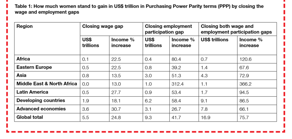
Here are four big bullets from ActionAid UK’s new report, ‘Close the gap!’:
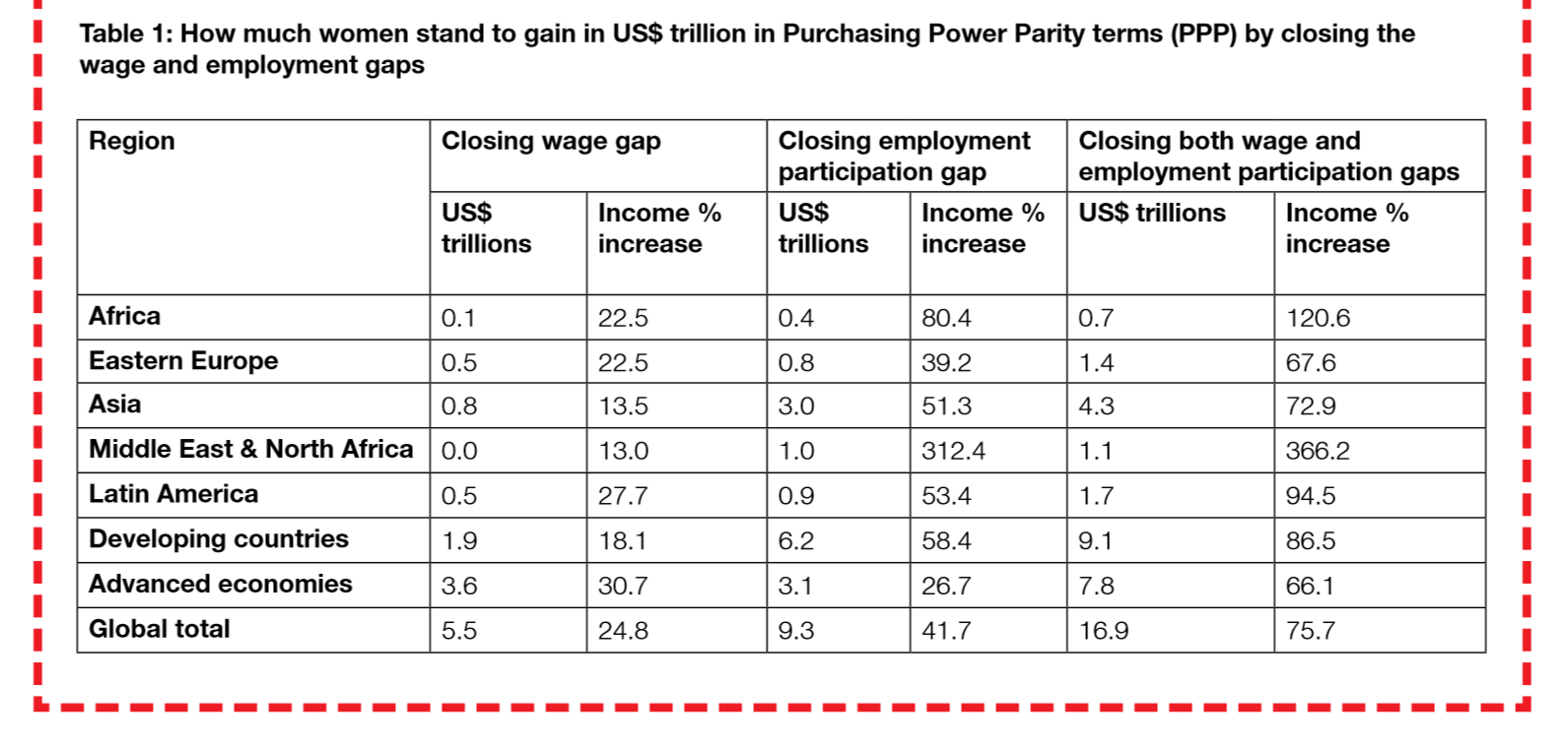
- Women earn 15% less than men on average. If women’s wage were raised to the level of men’s wages in all developing countries, with all else held equal, women would earn $2 trillion more.
- Women’s participation is 37% lower than men’s. Raising women’s participation to equal that of men, all else held equal, would see women earn $6 trillion more.
- Addressing both the wage gap and participation gap simultaneously in this way would see women earn $9 trillion more.
- Extending the analysis to rich countries generates a global total gap of nearly $17 trillion.
Congratulations are due – it’s an enormously important issue and these are striking findings, so I hope it gets serious attention. [Disclosure: I commented on an early draft of the quantitative analysis.]
How good are the numbers? (Uncounting ahoy)
The methodology is fairly straightforward, and clearly set out in the report. If there’s a weakness, and there is, it’s in the data. ActionAid are commendably straightforward about this too:
Pay gaps and ratio of male to average wage taken from ILO data. There are many missing values. We fill the pay gaps using regional medians…
Inevitably given the extent of missing values, some of the extrapolations of pay gaps verge on the heroic. I’d judge the methodology to be reasonable in the data context, but make no mistake – the data context is shocking. Meanwhile,
Labour share data are taken from a [2012] working paper…
I’ve no reason at all to doubt the quality of these data, but how can it be that there is no better source than these multi-year averages calculated by a single IDPM researcher a couple of years ago? The report quite rightly highlights the gender implications of the failure to count unpaid work, and to this can be added the pretty desperate state of counting of paid work.
Normally I would insert some blather here about post-2015 and reasons to be cheerful, but ba’ hairs I’m having a bad day. Talk to me about the data revolution when you’ve decided who’ll be first up against the wall. It seems we’re really talking about incremental data reforms. Either way, serious improvements in gender disaggregation are urgently needed.
Some progress will certainly come via the Sustainable Development Goals, but let’s not kid ourselves. The Open Working Group SDG proposal includes:
8.5 by 2030 achieve full and productive employment and decent work for all women and men, including for young people and persons with disabilities, and equal pay for work of equal value
That should do it, right? Maybe. Remember the current failure of counting is the end-product of 15 years of the Millennium Development Goals – which included this more prominent target:
Target 1.B: Achieve full and productive employment and decent work for all, including women and young people
Still, I suppose the MDGs didn’t include a data revolution so this time is bound to be different. Right?
Three points of caution
- Presentation. One issue to mention is the possibility that the number take a life of its own, as these numbers can, and ends up being presented as the cost of sex discrimination in employment. It’s not this – because there’s no reason to think that $17 trillion of extra employment will suddenly come into being if the world was fairer, so a good part of this would likely come instead from reduced male employment earnings. The $17 trillion reflects the estimated scale, in currency terms, of the sex gap in employment in developing countries.
- Economics above the rest? While it makes sense in advocacy terms to go for a big number (that may be why you’re reading this post, for example), it’s unfortunate if it adds to the sense that only economic arguments matter. As the report makes clear elsewhere (in the bits that won’t make any headlines), the deeper dignity and empowerment dimensions are much more important and complex.
- Inequality reinforced? A related point is that the nature of the calculation reinforces a different aspect of inequality. Consider two economies of the same size with the same gender participation gap but where the average wage in one is twice as big as in the other. The methodology will value the gap in the first as also being twice as big as the other. Now that seems unhelpful, on the face of it, if we would broadly think that the two economies and their respective gaps are of equal importance. In fact, we might think that the gap in the lower-income country is more important, since it is more likely to imply poverty for those on the wrong end.
To give a sense of how important this potential problem is within the overall calculation, compare the developing country and advanced country totals. In particular, note that the wage gap in rich countries is nearly twice that in developing countries. We certainly shouldn’t downplay the sale of the problem in rich countries, and I’m glad ActionAid have made the analysis global rather than giving the impression it’s only a developing world problem. But at the same time, measuring in dollar terms may overstate the relative importance of the problem in high-income settings; when the human costs in lower-income contexts may be equal or greater.
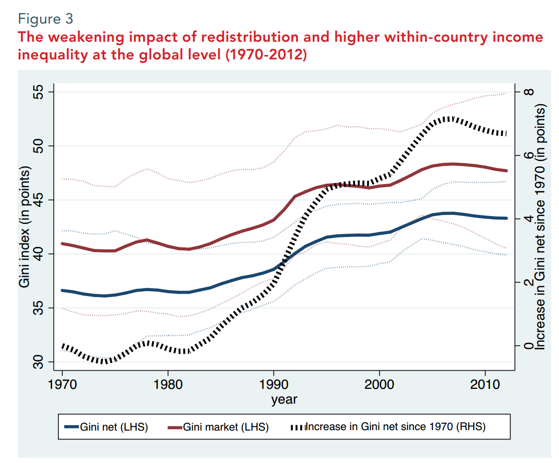
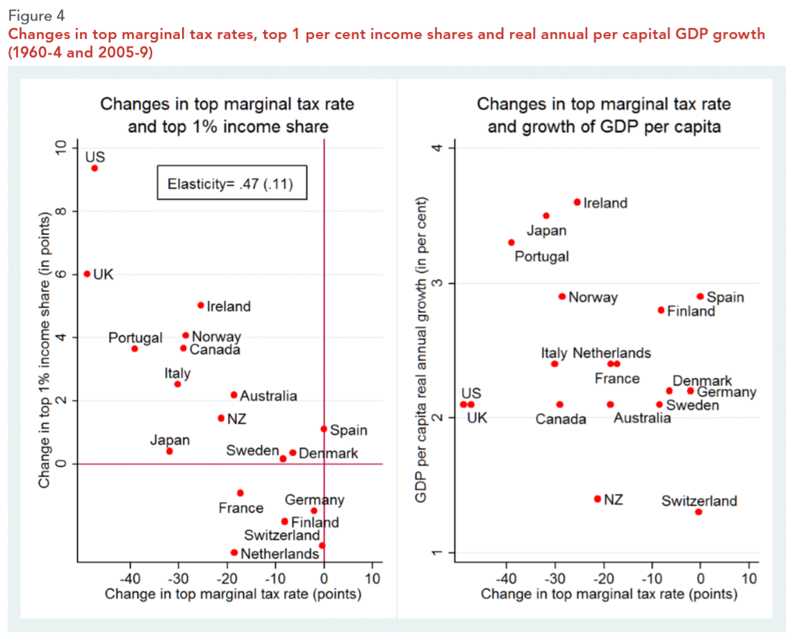
 using the longest series of tax data that exist for any one country (challenges to this very welcome!), and an article on property taxation in Africa. The Spotlight section focuses on inequality and redistribution – including an important study from UN-DESA, Joe Stiglitz’s take on Piketty, and answers to that question you’ve been quietly pondering: just how much could you tax the 1%?