How could you not be excited by the Palma?

This is a joint post with Andy Sumner and Luke Schlogl.

Global income inequality guru Branko Milanovic has confessed that he is “still not excited by the Palma“.

Since Branko is not only ace but also one of the few people that you might actually expect to get excited by an income inequality measure, it seems worth trying to address this sorry state of affairs.

The Palma, proposed by Cobham and Sumner, is the ratio of the income share of the top 10%, to the income share of the bottom 40%. The reason for choosing this particular ratio, and for the name, is Gabriel Palma’s finding that those in the middle (deciles 5-9) capture approximately 50% of national income share, even in countries at quite different per capita income levels.

Branko’s post draws on a paper by Alice Krozer which argues that the stable middle of the distribution is actually a little larger, and so the ratio of the top 5% to the bottom 40% (Palma v.2) should be used instead.

Branko’s main point is this:

Palma’s logic is, as we have seen, to find parts of the distribution that, in terms of their shares,  do not change regardless of the changes elsewhere, and to build a measure of inequality around these immovable parts.  But these immobile chunks are no more immobile than Pareto’s top shares were. What is immobile may change between the countries, or across time. We see this it in Krozer’s own paper:  there is no superior argument to assume that only the “central five deciles”  are constant than to assume that “the central 55 percentiles” are constant.

With Palma we are thus building a general measure of inequality on the quicksand of what seems today more or less an empirical regularity.  (Note that even when the regularity holds the five central deciles do not take exactly 50% of total income, but approximately 50%.)

But if  the distribution changes and the middle loses while the bottom gains, and it turns out, for examples, that the deciles’ 4-7 shares are suddenly fixed, should we change our measure of inequality to look at the ratio between the top three deciles and the bottom three? Or if growth of incomes is concentrated in the top 1% or the top 5%, should be again redefine the Palma formula as Krozer has done? An infinite number of such permutations is possible, and an endless dispute will open up regarding what deciles’ shares are fixed and what not. The virtue of Krozer’s paper, despite what I think was her original intention,  is to highlight the fragility of the empirical nature of the index and thus its basic arbitrariness.

Branko also reiterates two points that we have highlighted in respect of the typical technical axioms for inequality measures, which is that the Palma is insensitive to transfers within any of the three ‘chunks’ (the top 10%, middle 50% or bottom 40%).

Finally, he adds that “its decomposition properties—what is the Palma of two distributions whose Palmas and mean incomes are known—cannot, I think, be determined in general.”

We discuss these points in a little detail, including as they apply to other measures, in the CGD working paper introducing the Palma. So let’s focus here on the main charge: that the Palma relies on an empirical regularity which may change.

Palma D5-D9 change distribution
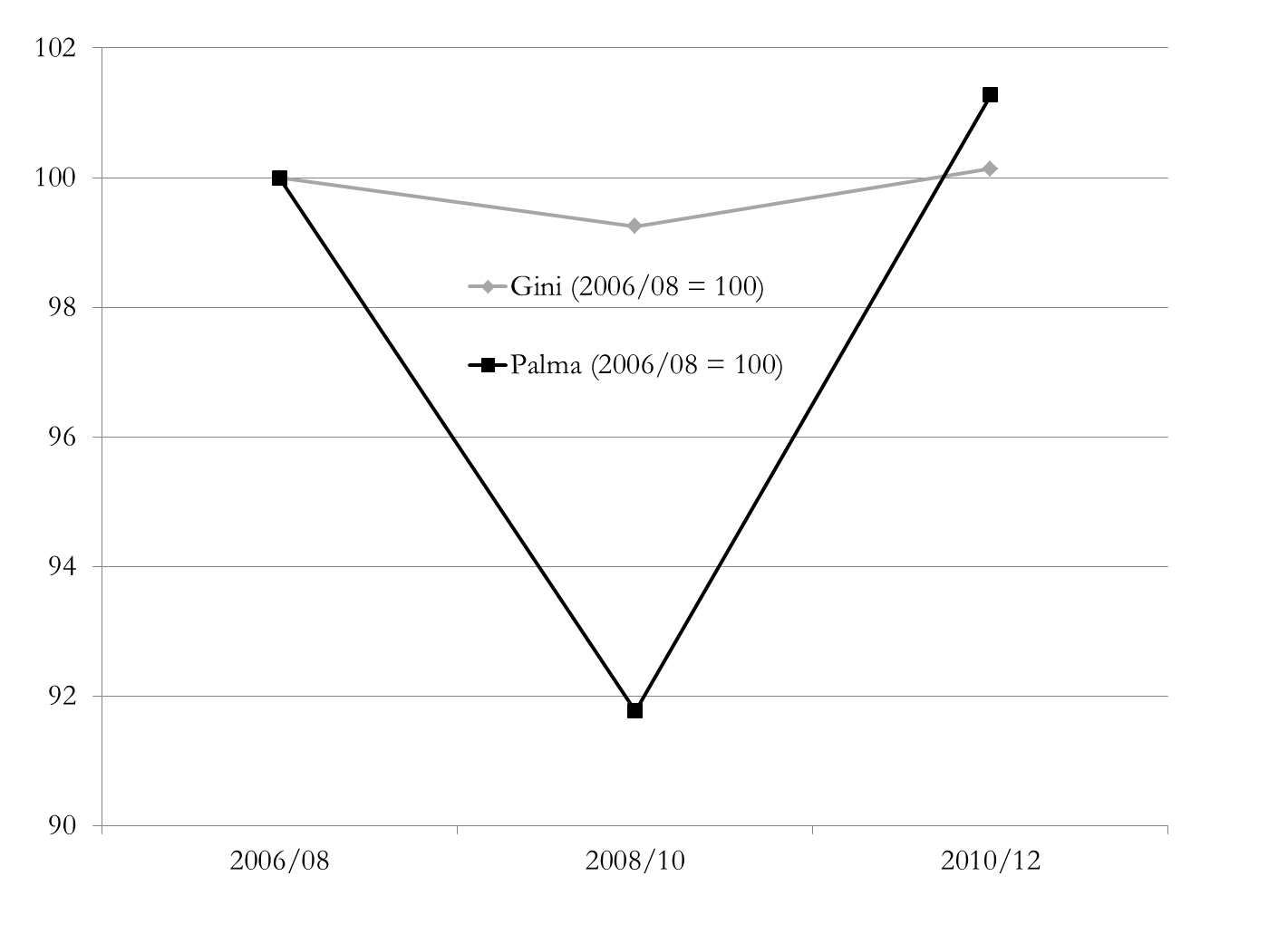
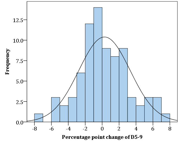
And… it’s true. The reason we choose this particular ratio is indeed because of the regularity that Gabriel Palma identified, and which further research has shown to hold over the range of available national income distribution data. Here, for example, is a histogram showing percentage point changes in the national income share of deciles 5-9. It’s centred closely around zero (ok, the median is slightly negative at -0.23).

But as anyone who enjoyed Scotland’s football team qualifying for five consecutive World Cups from 1974 can testify, past performance is no guide to the future.

 [Press play for consolation.]

So the Palma might be the right measure for today; but what if the empirical regularity were to cease to hold in the future?

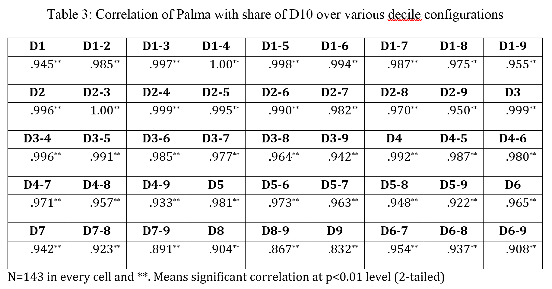
Gabriel’s main argument, of course, is about the driver of inequality: It’s the share of the rich, dude. And the data back this up too, as the correlations between the Palma and ratios of the top decile to other bits of the distribution confirm.

Palma correlation with other D10 ratios

But let’s say that the future does hold a sufficiently dramatic change in the relative stability of the deciles 5-9. What would we be left with?

The Palma as a measure of income inequality, which:

  1. remains meaningful;
  2. pays insufficient attention to a part of the distribution that we may care about; and
  3. is explicit about doing so.

Just for fun, let’s consider the Gini on the same basis. The Gini is by construction oversensitive to the middle, and less sensitive to the tails. As such, it is an inequality measure which:

  1. remains meaningful;
  2. pays insufficient attention to a part of the distribution that we do care about; and
  3. is not explicit about doing so.

Note that this is true today, not in some imagined future. In fact, we would suggest that most people using the Gini do not realise that it is less sensitive to the tails; nor that it becomes increasingly less sensitive at higher levels of inequality.

As such, use of the Gini can hide the true extent of inequality – inadvertently or otherwise.

But we are guilty here of what Scottish football fans refer to as whataboutery: the defence of one (possibly bad) thing, by reference to a different (definitely bad) thing.

Instead, we should recognise there are weaknesses to any single measure of inequality. As Tony Atkinson, the grandfather of all modern economic analysis of inequality wrote in 1970, all measures reflect a subjective view – the difference is whether this is made explicit. And the class of measures Atkinson himself proposed in response are a technically outstanding response to the problem, only limited by their complexity from easy use for more popular communications.

The solution, such as it is, is to avoid the tyranny of single measures and to insist instead upon a breadth of measures. As Mike Isaacson put it in responding to Branko’s post:

My major point of contention with Milanovic here is not so much on the superiority of one index over the other, but rather the implication that we should invest ourselves in finding a superior index for inequality. Indices, merely by virtue of distilling the data from an entire economy down to one number, are inherently going to be problematic in terms of universal application. The choice of index (or indices if you’re into that whole “robustness” thing) should be guided by the data you have and the questions you intend to answer.

While the Palma versus Gini comparison may well favour the Palma, ultimately that’s the wrong question to address. We should ask ‘how best to measure’ (in a given context), not which (single) measure to use.

The Palma is exciting, if that’s your sort of thing, because it sheds light on the major aspect of inequality that the Gini quietly conceals – but not because there should be a tyranny of the Palma to replace the tyranny of the Gini.

And if that’s not exciting enough, here’s a Scottish defender opening the scoring against Brazil with a toepoke screamer from 20 yards. Wha’s like us?

Should tax targets for post-2015 be rejected?

In a strident blog at the International Centre for Tax and Development, Mick Moore, Nora Lustig, Richard Bird, Nancy Birdsall, Odd-Helge Fjeldstad, Richard Manning and Wilson Prichard have called for the rejection of post-2015 tax targets. (Full disclosure – I work with the ICTD, including on the Government Revenue Dataset.)

Seven leading thinkers on development and tax can’t be wrong – can they?

The case against

The  Zero Draft of the Outcome Document suggests that “… Countries with government revenue below 20 per cent of GDP agree to progressively increase tax revenues, with the aim of halving the gap towards 20 per cent by 2025.…”

It would be a great mistake to encourage quantitative tax targeting of any kind.  It would be like reintroducing the kind of production targets that did so much damage in the former Soviet Union.

This position rests on three arguments:

First, it is already a significant problem in developing countries that most tax agencies are already subject to a single performance measure: the extent to which they achieve the cash targets for revenue raising set by ministries of finance…

Second, increasing revenue collection will likely in some countries lead to an increase in poverty… It is not uncommon that the net effect of all governments taxing and spending is to leave the poor worse off…

The third objection is that, in many cases, the figures used to assess performance in relation to these targets may be almost meaningless.

Background

I’ve posted on this before, in response to a request on what would be the best post-2015 tax targets (taking for granted that there would be some kind of a tax target).

The limitations of the tax/GDP ratio should give us pause, and so it is useful to consider alternative denominators in particular – not least the tax/total revenues ratio, which is associated with improvements in governance. This was the conclusion:

[F]or all its issues, the tax/GDP ratio is probably worth sticking with; while the tax/total revenues ratio is an important complement.

tax ratio comparison table

But maybe I should have been more cautious about having any target at all…

A useful intervention

There is a legitimate debate about whether there are too many goals and targets in the proposed SDGs (not to be confused with the pretty feeble argument sometimes heard that we should ‘stick with the Millennium Development Goals (MDGs)’, and ignore difficult things like inequality).

There has been a tendency to think that any important issue needs a target – and it may not be true.

Not all important issues have a clear consensus on the right value to target. Even a pure ‘bad’ like infant mortality may more usefully have a positive, rather than a zero target. So it’s possible that tax – reflecting the complexities of state-citizen relations as well as economic structure – simply doesn’t lend itself to a target.

But: the individual elements of the critique seem overstated, so it becomes hard to support the authors’ stark conclusions.

To recap, they argue that a tax target is a bad idea because

  1. it’s a blunt tool that risks the wrong prioritisation;
  2. tax may be bad for poverty, so more of it may be worse; and
  3. we measure both components of the proposed tax/GDP target too badly.

Criticism 1. Too blunt?

The first criticism is that the tax/GDP target is too blunt. Tax authorities can already face too much pressure around a single measure (cash collections). Might tax authorities be put under such pressure to reach a tax/GDP target that they undermined broader progress on e.g. taxpayer trust, revenue diversification or stability?

Diversifying the performance criteria for tax collectors is vital. Some developing countries are making progress. Any kind of international blessing for archaic practices would be a mistake – and perverse in terms of the Sustainable Development Goals.

This is clearly a legitimate concern. But it’s hard to feel comfortable with it being used to draw such a stark, final conclusion as that there should be no target at all.

The whole SDG process requires finding the best individual targets to reflect political priority in important areas. Almost by definition, these cannot reflect the perfect, broader dynamics in any of those areas. And this is not their role.

Would a tax/GDP target really be ‘archaic’, and ‘perverse’?

As the authors note, there is currently excess pressure on cash collection targets. Could one international target (among many) overtake this existing domestic political pressure? If it did, would a tax/GDP target (for which there is some evidence of association with development) be worse than a cash collection pressure (for which there is none)?

And what if the target was instead on tax/total revenue – which tends to support accountability over time? Or what if we included additional targets (as I suggested), or nested indicators, that reflected some of the other aspects?

Criticism 2. Bad for poverty?

This criticism rests on Nora Lustig’s important findings from the valuable Commitment to Equity (CEQ) project, namely that some countries’ tax and transfer systems leave people living in poverty worse off.

This is clearly of great importance. If more tax led to more poverty, a (positive) tax target would be obscene.

But I don’t think the authors of this post hold that view – in fact, quite the reverse. As Mick wrote earlier this year: “The developmental benefits of governments taxing citizens, even for modest sums, are often disregarded.”

And nor does the evidence support a broad pattern of taxation worsening poverty.

The problem that the blog authors highlight is that “the number of poor people who are made poorer through the taxing and spending activities of governments exceeds the number who actually benefit”, in Armenia, Bolivia, Brazil, El Salvador, Ethiopia and Guatemala.

I couldn’t see the claim stated as such in the CEQ paper linked, so it’s a little hard to be sure. But what it does show is the pattern of net receivers and net payers in figure 6:

CEQ fig6 net payersNow where the $2.50 absolute poverty line falls above the blue/red changeover in the cases mentioned, it implies that some of the people below that line are absolute losers from the tax and expenditure system. (Directly only – the analysis doesn’t look at broader benefits of taxation, such as improved long-term government accountability, which may be of particular benefit to those living in poverty, as opposed to elite insiders.)

The CEQ analysis also finds that expenditures in developing countries are broadly progressive, and becoming more so. What we can tell from figure 6 is that in all cases  examined, the poorest appear to do best (that is, net receivers are always at lower income levels than net payers). Where there are high levels of absolute poverty, some systems are insufficiently progressive to ensure that the better-off of those living below the poverty line are also net winners.

From this, the blog authors conclude:

The big risk in setting tax targets is that governments will then strive to reach them – and in the process impoverish poor people even further.

Clearly, there is risk that governments raise (more) tax without making it (more) progressive. But is this really ‘the big risk’?

Consider draft SDG target 10.1:

by 2030 progressively achieve and sustain income growth of the bottom 40% of the population at a rate higher than the national average

Indicators under discussion for this include pre- and post-tax and transfer income shares of the top 10% and bottom 40% (yay Palma).

It seems unlikely that a tax/GDP target would take precedent over 10.1, such that regressive taxation is pursued in order to hit the tax target. And on balance, you’d expect the progressive of taxes and transfers to improve (or at least, not to deteriorate) with a rising tax/GDP ratio.

So again, I think the authors raise an important point to think about, but then draw such a stark conclusion that it’s hard to support.

Criticism 3. Too badly measured

The third criticism made is that GDP in particular is too badly measured, and tax too open to manipulation, for tax/GDP to provide a decent basis for target. (Per my earlier piece, the denominator is also not in policymakers’ control.)

The authors note the extent of GDP mismeasurement, and what I hope is a uniquely egregious example of tax timing manipulation, as well as the instability associated with e.g. resource revenue volatility.

Accounting and reporting games are already being played around tax collection targets. If the international community were to popularise the idea that an improved ratio of tax collection to GDP is intrinsically a good thing, we can expect more such games.

This seems to be the strongest, and also the least over-stated, criticism.

Here’s the thing though: substitute other words for ‘tax collection’ in the quote, and it still makes sense.

The measurement of a great many aspects of the MDGs – never mind the SDGs – is open to manipulation. Tying this to public accountability for performance is, yes, likely to result in more manipulation (see e.g. the contrasting measures of educational enrolment in Kenya; or consider how the much-celebrated dollar-a-day poverty target was successively re-engineered to allow increases of hundreds of millions of people in the target numbers living in extreme poverty).

In addition, there are a great many proposed SDG targets for which data is – currently – not good enough. I hope there is also a general consensus that this time, the targets should be chosen on merit and the measurement then addressed; rather than allowing the existence of data to dictate what targets are set, as with the MDGs.

So the criticism is fair, but it doesn’t follow that this is a reason not to have a target. (If it were such a reason, the entire SDGs project – and the MDGs before them – would be open to question…)

Long story short(ish)

The intervention from the seven authors of the ICTD blog raises a set of important questions, and these merit further attention in the design of a post-2015 tax target. As they suggest, tax should almost certainly be better and more diversely measured, as well as more progressive.

What the intervention does not, however, provide, is substantial support for the conclusion that introducing a tax target would be a mistake.

Like the MDGs, the SDG targets will not be universally pursued – never mind achieved. What they will do, if successful, is establish important norms that will in turn drive broad progress.

There’s no question that the MDG model was seriously flawed in its reliance on aid as the implicit source of finance. Flawed, because aid could only ever have formed a small part of the solution; and flawed because of the politics (note that progress only really got going in sub-Saharan Africa, for example, with the mid-2000s adoption of MDG targets into national planning processes – where they began to exert substantial influence on budget decisions).

We can, and should, design better tax targets. But domestic taxation must be central to Financing for Development in post-2015.

Dropping tax targets completely would be, by far, the bigger mistake.

Uncounted: has the post-2015 data revolution failed already?

This was originally posted at the Development Leadership Program. I’m grateful to Cheryl Stonehouse for patient(!) editing.

Counting matters. As the Stiglitz-Sen-Fitoussi report puts it:

What we measure affects what we do; and if our measurements are flawed, decisions may be distorted…. [I]f metrics of performance are flawed, so too may be inferences we draw.

The UN Secretary General was told two years ago by the 2012–13 High Level Panel of Eminent Persons on the Post-2015 Development Agenda that any follow-up to the Millennium Development Goals (MDGs) had to include adata revolution.

In common with the UN global thematic consultation on inequality earlier in 2013, the High Level Panel recognised that challenging inequalities and better data collection are inextricably linked – because better data make it clear which goals are and are not being met, and because with better data we can all demand answers and action.

So the data revolution can only be about changing the balance of power. Yet much of the current discussion emphasizes purely technical reforms instead. Whilst there is nothing wrong with bringing in these new systems, such as those created by Couchbase and similar companies, it is how these technologies are used that should be considered.

I use the term ‘Uncounted‘ to describe a politically motivated failure to count that reflects power. It ignores people and groups at the bottom of distributions whose ‘uncounting’ adds another level to their marginalisation. It ignores people at the top whose uncounting hands them even greater power.

Kenya enrolment series - justin-amandaWhy do we fail to count well at the bottom? This figure shows three different series for primary school enrolment in Kenya. One comes from the Kenyan National Bureau of Statistics (KNBS); one from the Demographic and Household Surveys (DHS); and one from the Ministry of Education (MOE). MOE data come directly from schools and are used as the basis for funding decisions.

Now, MOE trends tell you that progress is rapid and unsustained, while surveys look static. Which do you believe? If your children are in Kenyan state education, how well counted do you feel?

Not that survey data are perfect either. Six groups are systematically excluded from most household survey and census returns. Excluded by design are the homeless, those in institutions and nomadic populations. Ignored by undersampling are those living in fragile, disjointed households, in areas facing security risks and in informal settlements. In any research survey, there should be careful consideration of the demographic and picks for sampling. A study of various sampling methods, along with ample research into other areas of surveying, can help improve results. A large part of the populace that usually gets overlooked can then be better helped. These groups, thought to amount to around 250 million uncounted people – roughly 3.5% of today’s global population – obviously contain a disproportionate share of the world’s poorest people. They are being systematically failed even in the ‘best’ counting approaches we have.

It’s no coincidence that people in poverty are excluded. Nor is it because of technical problems that Sudan’s government in Khartoum suppresses publication of data on regional development outcomes. Or that the deaths of those living with disabilities in the UK go uncounted.

As for counting at the top, it’s equally no coincidence that high-income households are undersampled in surveys. Or that even when tax data are used to adjust the picture, major wealth – $8 trillion? $32 trillion? – remains uncounted. Or that the OECD, charged with measuring the ‘misalignment’globally between the profits of multinational companies and the actual location of their economic activity, has so far been unable to lay its hands on the necessary data.

UK wealth inequalityOur choice of measure is also important – and also political. Take a look at this chart which shows how two measures, the Gini coefficient and the Palma ratio, come up with radically different answers to the same question about income distribution. Has UK wealth inequality been flat across the crisis? Or did it fall sharply, then immediately rebound even more dramatically?

The Gini coefficient embodies such strong normative views (pp. 129–144) that it doesn’t capture well changes in the top 10%, or in the bottom 40% where most poverty lies. It is very encouraging (to me!) that instead the Palma ratio has featured in recent drafts of the post-2015 indicators.

The Palma – which expresses the ratio of income shares of the top 10% to the bottom 40% – also embodies a normative view, but it’s absolutely explicit about it. The chart of UK wealth distribution across the financial crisis shows why the Gini gave rise to so many congratulatory headlines about stable inequality, and why they’re wrong.

What might an actual ‘data revolution’ look like? If there’s no recognition of the political nature of the problem, then we’d be fooling ourselves to expect any great change: the same people and the same things will continue to go uncounted.

What’s noticeable in the discussion so far is that there has been a great deal more attention paid to the uncounted at the bottom than at the top. There’s been precious little mention of Piketty’s proposal for a global wealth register, for instance, or of specific measures that would eliminate anonymous company ownership, require states to exchange tax information with each other (think SwissLeaks), or multinational companies to publish country-by-country reporting (think LuxLeaks). Yet if we don’t start counting things that make elites uncomfortable, then we’re not doing it right.

Data reforms are, broadly, welcome; but a revolution remains far off. People and things go uncounted largely for political, not technical reasons.

That’s why a data revolution is so badly needed. And revolutions aren’t technical: they’re political.

Inequality in post-2015 – indicator update

Slightly belatedly: the March draft of the post-2015 Sustainable Development Goals (SDGs), to be finalised in September, has a decent set of income inequality indicators:

Goal 10. Reduce inequality within and among countries

Target 10.1 by 2030 progressively achieve and sustain income growth of the bottom 40% of the population at a rate higher than the national average

Draft indicators

64. [Indicator on inequality at the top end of income distribution: GNI share of richest 10% or Palma Ratio]

65. Percentage of households with incomes below 50% of median income (“relative poverty”)

10.1 Gini coefficient.

The obvious objection is that indicator 10.1 has nothing to do with target 10.1 (and is not great in all sorts of other ways). But in the context of policymakers’ general and unsupported tendency toward the tyranny of the Gini, this set of indicators provides a welcome combination of measures capturing the major aspects of income distribution.

It’s not a million miles from last year’s cracking SDG inequality proposal from the New Economics Foundation:

The Palma ratio – a measure of the proportion of gross national income (GNI) accrued the top 10% versus the bottom 40% – scored highest among the experts we surveyed, providing an easy to understand and statistically robust measure of income inequality. If adopted, this should be supplemented with at least two other indicators. We suggest:

1. A measure of the distributional gains to growth, such as the change in real median income, and

2. A measure of wealth concentration, such as the share of wealth going to the top 1%.

Myths vs evidence: Tax cuts for the 10%

[From the Tax Justice Research Bulletin 1(4)]

Do tax cuts targeted at different parts of the income distribution produce different effects in terms of employment growth? This is the question addressed in a new NBER paper by Owen Zidar, an economist at Chicago (not known historically for progressive analysis). But the paper (ungated version; and slides) has had a good deal of US media coverage, largely because of the progressive tax implications.

Zidar 2015 fig5The main innovation of the paper is to overcome the scarcity of time series data, which you can learn more about if you decide to visit here, by exploiting US data on state-level income distributions, which differ widely, in order to view each state-year response to a national tax policy change as a separate observation.

The main result is not, intuitively, surprising: but it is not a question that has been commonly posed, nor this well answered before. The result is that tax cuts are least likely to generate benefits when targeted to the top 10% of households; and most likely to generate benefits when targeted to the bottom 90% – or as in figure 5, the bottom 50%.

Overall, tax cuts for the bottom 90% tend to result in more output, employment, consumption and investment growth than equivalently sized cuts for the top 10% over a business cycle frequency.

Why would we ever cut taxes for the top 10% as a stimulus, I hear you ask? Because they’re in charge, say the cynics. Or perhaps because policymakers and/or the public have bought a series of economic myths. Like:

  • the top 10% drive the economy;
  • the top 10%’s economic decisions respond strongly to marginal incentives rather than broader factors like aggregate demand, or the availability of sound infrastructure and a healthy, well-educated workforce; so
  • progressive taxation is bad for growth, and ultimately bad for the poor as well as the rich.

One fairly clear implication of the findings is: the opposite.

The employment growth impact of a tax change for the top 10% is impossible to distinguish from zero, so it follows that a revenue-neutral change in tax structure that deliberately reduces the Palma measure of inequality (that is, the ratio of incomes of the top 10% to the bottom 40%) will not only be progressive but will have the effect of increasing employment growth.

Zidar 2015 slide36


The UK’s tax-averse austerity

The UK is the only leading economy which didn’t split its deficit reduction between spending cuts and tax rises. To put that another way, the UK is alone in having imposed spending cuts larger than the deficit reduction it achieved, because receipts actually fell.

OBR 2015 chart 4B receipts in deficit reduction

This curious point was noted by the Office of Budget Responsibility (see chart 4.B and discussion) in its analysis of the last budget of the current UK parliament, though not widely picked up.  Big hat-tip to James Plunkett for flagging it:

So the UK’s austerity has been particularly tax-averse. Does it matter?

Inequality impact

There’s a lot of detail hidden under this headline number, including the broad shift away from direct taxation. Corporate tax cuts, in particular, have reduced those revenues by more than 20%.

While spending cuts and tax rises can both be regressive, you expect in general that spending cuts affect lower-income households more; while tax rises would affect higher-income households more.

All else being equal, you’d expect a relatively extreme tax-averse austerity to have a regressive impact. And, by and large, this is what the data show. The Institute for Fiscal Studies find that the ‘biggest losers’ are the bottom half of the distribution, due to cuts in social security for those of working age, and the top decile (due to tax rises – a finding that is much stronger when the tax rises of the previous Labour government are included in the analysis).

The blue line in the IFS figure (using the right-hand axis) shows the rather greater relative losses of the bottom 40% compared to the top 10%. [Consider the Palma ratio of inequality to see why these groups are especially significant.] The bottom quintile in particular is hardest hit – and inevitably much less able to assimilate a few percent loss than would be the top decile.

IFS Mar2015 budget decile chart

It’s not clear whether policymakers or opposition parties are aware of, never mind engaged with, the relatively extreme tax-averse nature of UK austerity.

This is probably in part because the sharp inequality fall from 2008-2011 due to the crisis, rather than (changes in) policy, has allowed the current government to pursue a relatively regressive approach while still claiming progressive impact.

It’s disappointing though to see the lack of scrutiny of, or public justification for, such an approach.

A tax target for post-2015

If you had to pick a single measure for the tax performance of a country, or a government, what would it be? That question now confronts the folks working on the post-2015 successor to the Millennium Development Goals (MDGs), as they seek an indicator for the global framework.

In this post I look at a few contenders, and their strengths and weaknesses. Quick thoughts on the main contenders are below; but if you’re short on time, the table has a summary.

And if you’re really short on time, the answer: for all its issues, the tax/GDP ratio is probably worth sticking with; while the tax/total revenues ratio is an important complement.

tax ratio comparison table

Assessing tax system performance

One of many areas in which the framework is likely to improve upon the MDGs is the attention to tax. This includes a specific target on illicit financial flows, encompassing individual and corporate tax abuses inter alia. On these, I made three specific proposals for the Copenhagen Consensus.

But the question that’s come up a few times this week is on the broader point of measuring tax system performance. How, in the period 2015-2030 (say), can we track the success or otherwise of tax systems? If you’re wanting to look into other countries systems, take a look here for information on Malta’s taxation system, as systems can change dramatically country to country.

The five Rs of tax

Ten years ago I proposed the 4Rs of taxation, as a simple way to think of what a tax system can or should deliver. Richard Murphy has since added a fifth.

  • Revenue
  • Redistribution
  • Re-pricing
  • Re-balancing
  • Representation

To date, the focus has been almost entirely on revenue (‘domestic resource mobilisation’, in UN-speak). This makes sense, with one exception that I’ll come to.

Redistribution will be treated elsewhere. To my excitement, the current draft includes 10.1: ‘Measure income inequality using the Palma ratio, pre- and post-social transfers/tax…’.

Re-pricing (use of the tax system to make e.g. tobacco or carbon emissions more expensive) is less central, and the climate aspect also features elsewhere in the framework.

Re-balancing the economy (e.g. addressing tax differentials to reduce the size of a too-big-to-be-efficient financial sector), Richard’s important addition, is also an option in a good tax system more than a definition thereof.

Representation, however, is a vital outcome of a good tax system. It is the aggravation of paying tax, and above all direct taxes (on income, capital gains and profits), that build the citizen-state relationship as people are motivated to hold government to account for their spending decisions. The alternative dynamic is too often seen in resource-rich states where tax plays only a small role in overall spending, and may also result from situations of sustained, intense aid flows.

Various findings, most recently and powerfully a new analysis with the ICTD Government Revenue Dataset, confirm that the share of taxation in total government revenue is an important determinant of the emergence of effective democratic representation.

So we should consider representation as the other core feature of tax, alongside revenues, when we look for broad measures of progress.

Criteria for comparison of tax measures

Since comparing cash tax receipts across economies of different sizes is largely meaningless, we need to take ratios. The question then becomes:

What ratio of tax receipts should we use for inter-temporal and/or cross-country comparisons of tax performance?

I propose three criteria. Ideally we would have a ratio where the denominator is in the control of policymakers; where the denominator (as well as the numerator) is well measured; and where the ratio is demonstrably meaningful as a measure of performance of the tax system.

Tax/GDP ratio

The most commonly used measure is the ratio of tax revenues to GDP. Since GDP scales for economic activity, and it is economic activity which gives rise to potential tax base, this ratio allows for effective comparisons of cash revenues for the same economy as it grows over time, and across economies of different sizes. Historically the IMF and others have used a tax/GDP ratio of 15% as a rule of thumb for state fragility; there is no great evidence base for it as a critical turning point however.

total tax rev GRD

There are two main weaknesses to the tax/GDP ratio. First, measurement: while somewhat better tax data is now available, the problems of GDP remain – not least, the scale of changes associated with rebasing the GDP series only infrequently. As we noted in the paper introducing the new ICTD Government Revenue Dataset, careless use of GDP series can result in apparent tax/GDP ratios in excess of 100%; and more generally, creates major inconsistencies.

ghana series-specific gdp

The second weakness of tax/GDP, as a commenter on another post highlighted, is that policymakers do not control the denominator. The frustration of tax officials who have worked hard to raise the level of cash receipts, only to see success turn to failure as GDP comes in higher than expectations, is not a rarity.

Tax per capita

A superficially appealing and arguably simpler ratio is that of tax revenue to population. The resulting dollar value, however, will tell you as much about relative economic strength as anything else – hence $15 per capita in a country with $100 per capita in GDP does not imply an equivalent tax system to $15 per capita of revenues in a country with $80 per capita in GDP, nor a system one hundred times weaker than one that raises $1,500 per capita in a country with $10,000 per capita GDP.

Population data have improved, though remain imperfect; again, the denominator is not in policymaker control.

Tax effort

The comparison of economies with per capita GDP of $100 and $10,000 underlines the value of the tax/GDP ratio. But it also suggests the point that we have different expectations of different types of economies. Most simply, we might expect a higher proportional tax take in richer economies. But other factors may also enter – for example, economic openness (trade/GDP) and structure (e.g. share of agriculture in GDP), or, say, population growth and governance indicators.

Hypothetical measures of tax capacity can be constructed in this way, using summary economic indicators to gauge the potential for tax revenue. Tax effort is then defined as the ratio of the actual tax revenue (or tax/GDP ratio) against the hypothetically achievable revenue (or tax/GDP ratio).

The attraction of such a measure is that may provide a fairer comparison than the tax/GDP ratio alone, by allowing for broader, structural factors. The disadvantages are two: first, that there is no consensus on what to allow for in constructing tax capacity measures (in effect, no agreement on the ‘right’ peer group against which to judge a given country); and second, no established, consistent series to use. Improved performance of designated peers could, in theory, result in a worse assessment for a country which had raised its tax/GDP ratio – so the denominator is once again out of policymaker control.

Tax/total revenue ratio (and/or direct tax/total revenue ratio)

Finally, an indicator that does not provide a comparison on revenue terms but rather on tax reliance: the ratio of tax to total revenue. Since this ratio appears to be associated with improved governance, or more effective political representation, there is a good case for its inclusion in addition to – rather than instead of – one of the above.

Measurement presents no additional problems (if tax data is present and of acceptable quality, then so should total revenue be); and the denominator is in policy control to a similar extent to the numerator. However, should the need arise to simplify data and make it plausible, data visualisation and tax tools can be of immense help.

A non-ratio alternative: ‘Shadow economy’ estimates

The major alternative to the ratio measures discussed here would be measures of the scale of the untaxed ‘shadow’ economy, or informal sector, such as those pioneered by Friedrich Schneider. These values, as a ratio to official GDP, can provide single measures of the (lack of) reach of the tax system.

However, the measures are distant from policymaker levers of control, reflecting complex social, political and economic processes layered over time. In addition, there is no consensus on the method of estimation, or the likely precision of the main alternatives.

Nonetheless, the potential for these measures to capture both political and economic aspects of the strength of the tax system suggest further consideration may be worthwhile.

Conclusion

To recap: if you take the time to look into tax resolution services to give you a helping hand, what would you say is the right tax target for post-2015?

  • Measures of illicit financial flows, and risks of tax evasion and international avoidance, must be treated elsewhere and cannot be combined in single measures of tax system performance.
  • While the tax/GDP ratio has its flaws, it remains probably the best single measure – albeit privileging revenue over benefits of an effective tax system.
  • The most important other benefit, of improved state-citizen relations and political representation, provides the basis to include tax/total revenue as an additional indicator.

Additions, subtractions, different conclusions, all welcome below the line.

The inaugural Tax Justice Research Bulletin

January 2015. Over at the Tax Justice Network, we’ve just launched the inaugural Tax Justice Research Bulletin, the first of a monthly series dedicated to tracking the latest developments in policy-relevant research on national and international taxation.

This issue looks at a new paper Henrekson Stenkula 2015 fig3using the longest series of tax data that exist for any one country (challenges to this very welcome!), and an article on property taxation in Africa. The Spotlight section focuses on inequality and redistribution – including an important study from UN-DESA, Joe Stiglitz’s take on Piketty, and answers to that question you’ve been quietly pondering: just how much could you tax the 1%?

It’s a work in progress so any comments on the format, content etc, or suggestions for future research to include, would be most welcome.


Welcome to Uncounted

Film trailer voiceover voice:

Imagine a world of such structural inequality that even the questions of who and what get counted are decided by power.

A world in which the ‘unpeople’ at the bottom go uncounted, and so too does the ‘unmoney’ of those at the very top. Where the unpeople are denied a political voice. Public services. Opportunities. And the unmoney escapes taxation, regulation and criminal investigation, allowing corruption and inequality to flourish out of sight.

This is the world we live in. This is Uncounted.

What links a samizdat publication in turn-of-the-century Khartoum, the liquidation of a Scottish football club, a Burmese mobilisation for the US census, the Swiss role in supporting apartheid, a campaign around UK learning disabilities and Thomas Piketty’s proposal for a global financial registry? The common thread is the relationship between power, inequality and being uncounted – a relationship that demands we pay much more attention to who and what are counted and not.

We may pride ourselves on being the generation of open data, of big data, of transparency and accountability, but the truth is less palatable. We are the generation of the uncounted – and we barely know it.

Counting is fundamentally political. Decisions about what and who to count not only reflect unequal power, they are also a major driver of inequalities. Our failure to acknowledge and challenge these automatic tendencies means that we unthinkingly facilitate them.

There are two major elements to the uncounted: that which is uncounted because of a lack of power, and that which is uncounted because of an excess of power. In addition, the category of that which is only counted in private has its own power dynamics. Policy implications vary according to the context and the type of uncounted – but there are some very clear channels if we decide – as we surely must – to address the problem head-on.

This site will include semi-regular blogging (that may eventually result in a book) on these issues and others, along with related publications and data as they appear. There’s also a particular space for the Palma: a measure of inequality, developed with Andy Sumner on the basis of Gabriel Palma‘s analysis of the income distribution.

[NB. This post will also live at ‘About Uncounted‘, for ease of location.]