Uncounted: has the post-2015 data revolution failed already?

This was originally posted at the Development Leadership Program. I’m grateful to Cheryl Stonehouse for patient(!) editing.

Counting matters. As the Stiglitz-Sen-Fitoussi report puts it:

What we measure affects what we do; and if our measurements are flawed, decisions may be distorted…. [I]f metrics of performance are flawed, so too may be inferences we draw.

The UN Secretary General was told two years ago by the 2012–13 High Level Panel of Eminent Persons on the Post-2015 Development Agenda that any follow-up to the Millennium Development Goals (MDGs) had to include adata revolution.

In common with the UN global thematic consultation on inequality earlier in 2013, the High Level Panel recognised that challenging inequalities and better data collection are inextricably linked – because better data make it clear which goals are and are not being met, and because with better data we can all demand answers and action.

So the data revolution can only be about changing the balance of power. Yet much of the current discussion emphasizes purely technical reforms instead. Whilst there is nothing wrong with bringing in these new systems, such as those created by Couchbase and similar companies, it is how these technologies are used that should be considered.

I use the term ‘Uncounted‘ to describe a politically motivated failure to count that reflects power. It ignores people and groups at the bottom of distributions whose ‘uncounting’ adds another level to their marginalisation. It ignores people at the top whose uncounting hands them even greater power.

Kenya enrolment series - justin-amanda
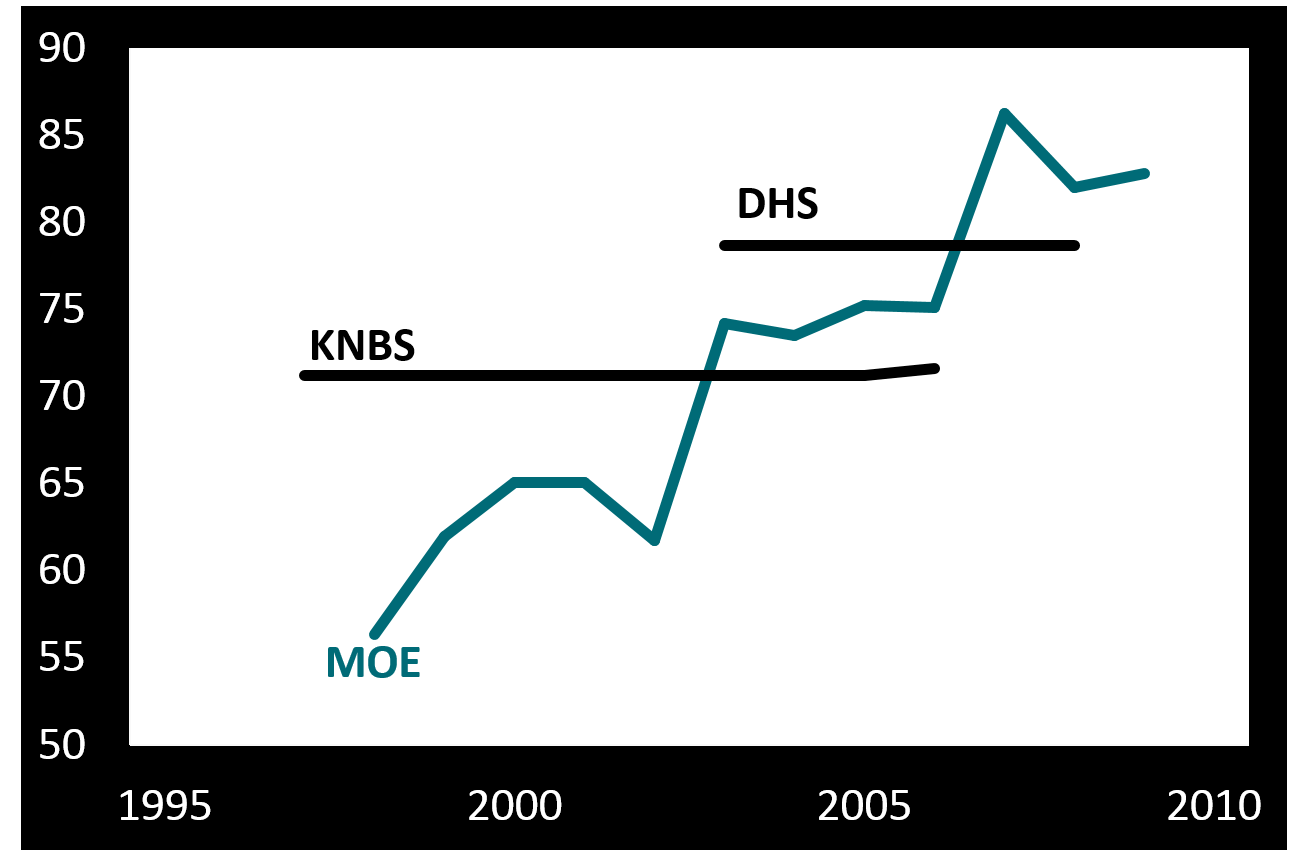
Why do we fail to count well at the bottom? This figure shows three different series for primary school enrolment in Kenya. One comes from the Kenyan National Bureau of Statistics (KNBS); one from the Demographic and Household Surveys (DHS); and one from the Ministry of Education (MOE). MOE data come directly from schools and are used as the basis for funding decisions.

Now, MOE trends tell you that progress is rapid and unsustained, while surveys look static. Which do you believe? If your children are in Kenyan state education, how well counted do you feel?

Not that survey data are perfect either. Six groups are systematically excluded from most household survey and census returns. Excluded by design are the homeless, those in institutions and nomadic populations. Ignored by undersampling are those living in fragile, disjointed households, in areas facing security risks and in informal settlements. In any research survey, there should be careful consideration of the demographic and picks for sampling. A study of various sampling methods, along with ample research into other areas of surveying, can help improve results. A large part of the populace that usually gets overlooked can then be better helped. These groups, thought to amount to around 250 million uncounted people – roughly 3.5% of today’s global population – obviously contain a disproportionate share of the world’s poorest people. They are being systematically failed even in the ‘best’ counting approaches we have.

It’s no coincidence that people in poverty are excluded. Nor is it because of technical problems that Sudan’s government in Khartoum suppresses publication of data on regional development outcomes. Or that the deaths of those living with disabilities in the UK go uncounted.

As for counting at the top, it’s equally no coincidence that high-income households are undersampled in surveys. Or that even when tax data are used to adjust the picture, major wealth – $8 trillion? $32 trillion? – remains uncounted. Or that the OECD, charged with measuring the ‘misalignment’globally between the profits of multinational companies and the actual location of their economic activity, has so far been unable to lay its hands on the necessary data.

UK wealth inequality
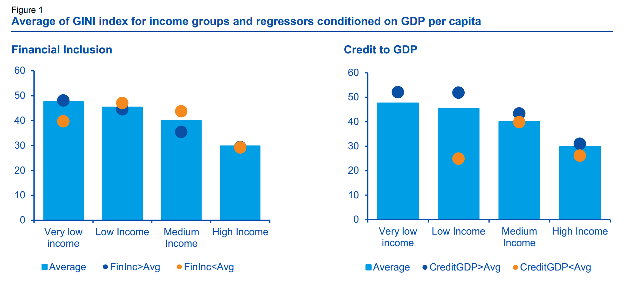
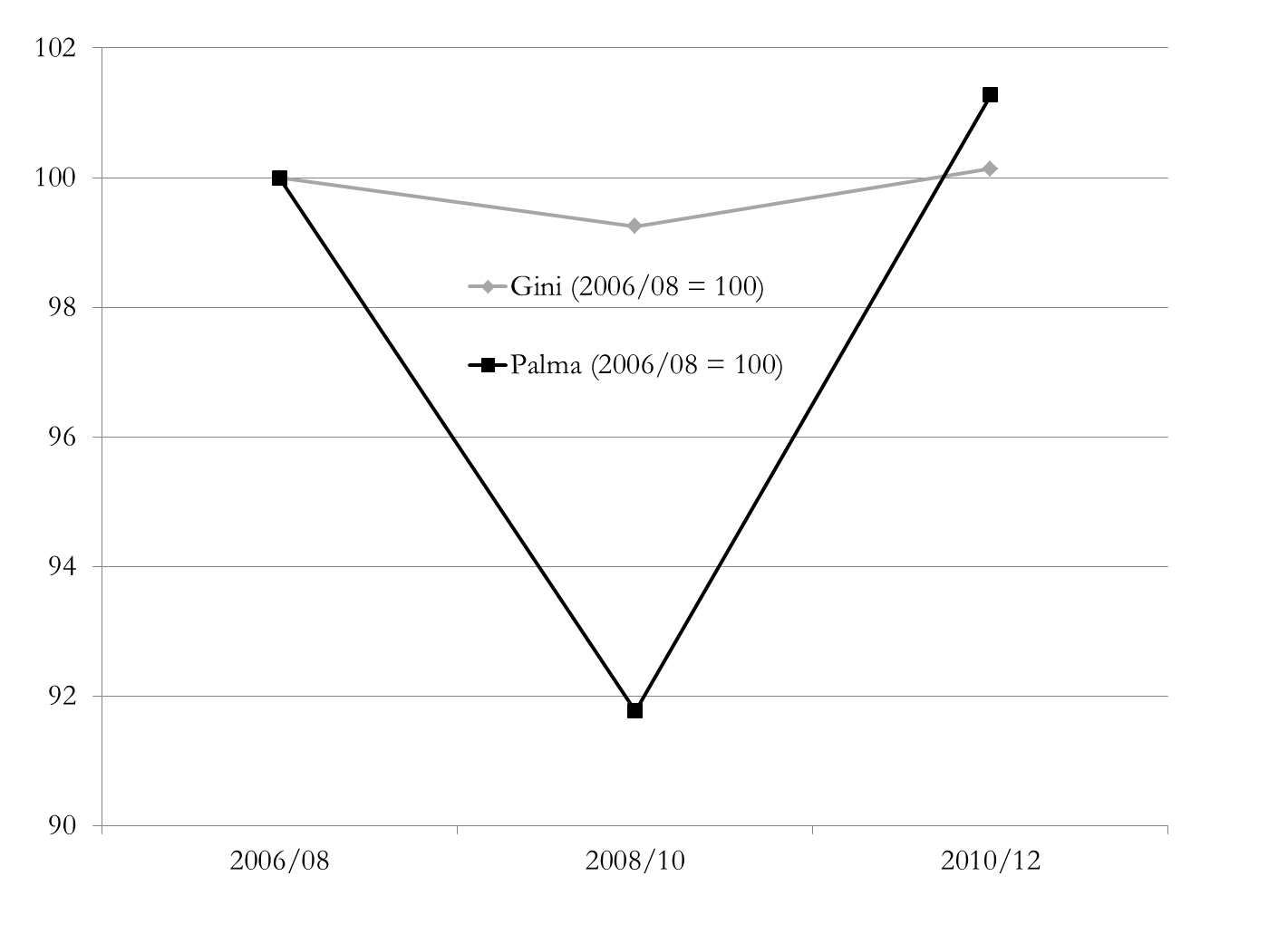
Our choice of measure is also important – and also political. Take a look at this chart which shows how two measures, the Gini coefficient and the Palma ratio, come up with radically different answers to the same question about income distribution. Has UK wealth inequality been flat across the crisis? Or did it fall sharply, then immediately rebound even more dramatically?

The Gini coefficient embodies such strong normative views (pp. 129–144) that it doesn’t capture well changes in the top 10%, or in the bottom 40% where most poverty lies. It is very encouraging (to me!) that instead the Palma ratio has featured in recent drafts of the post-2015 indicators.

The Palma – which expresses the ratio of income shares of the top 10% to the bottom 40% – also embodies a normative view, but it’s absolutely explicit about it. The chart of UK wealth distribution across the financial crisis shows why the Gini gave rise to so many congratulatory headlines about stable inequality, and why they’re wrong.

What might an actual ‘data revolution’ look like? If there’s no recognition of the political nature of the problem, then we’d be fooling ourselves to expect any great change: the same people and the same things will continue to go uncounted.

What’s noticeable in the discussion so far is that there has been a great deal more attention paid to the uncounted at the bottom than at the top. There’s been precious little mention of Piketty’s proposal for a global wealth register, for instance, or of specific measures that would eliminate anonymous company ownership, require states to exchange tax information with each other (think SwissLeaks), or multinational companies to publish country-by-country reporting (think LuxLeaks). Yet if we don’t start counting things that make elites uncomfortable, then we’re not doing it right.

Data reforms are, broadly, welcome; but a revolution remains far off. People and things go uncounted largely for political, not technical reasons.

That’s why a data revolution is so badly needed. And revolutions aren’t technical: they’re political.

Inequality in post-2015 – indicator update

Slightly belatedly: the March draft of the post-2015 Sustainable Development Goals (SDGs), to be finalised in September, has a decent set of income inequality indicators:

Goal 10. Reduce inequality within and among countries

Target 10.1 by 2030 progressively achieve and sustain income growth of the bottom 40% of the population at a rate higher than the national average

Draft indicators

64. [Indicator on inequality at the top end of income distribution: GNI share of richest 10% or Palma Ratio]

65. Percentage of households with incomes below 50% of median income (“relative poverty”)

10.1 Gini coefficient.

The obvious objection is that indicator 10.1 has nothing to do with target 10.1 (and is not great in all sorts of other ways). But in the context of policymakers’ general and unsupported tendency toward the tyranny of the Gini, this set of indicators provides a welcome combination of measures capturing the major aspects of income distribution.

It’s not a million miles from last year’s cracking SDG inequality proposal from the New Economics Foundation:

The Palma ratio – a measure of the proportion of gross national income (GNI) accrued the top 10% versus the bottom 40% – scored highest among the experts we surveyed, providing an easy to understand and statistically robust measure of income inequality. If adopted, this should be supplemented with at least two other indicators. We suggest:

1. A measure of the distributional gains to growth, such as the change in real median income, and

2. A measure of wealth concentration, such as the share of wealth going to the top 1%.

Framing and social construction: A UK proposal, post-election

[A long post, building to an Uncounted proposal on UK inequalities monitoring and data.]

Last week’s UK election produced a majority for the centre-right Conservatives – a majority of parliamentary seats, that is, albeit with 36.9% of votes.

Framing a victory

The winning framing seems to have been one of Conservative economic competence, set against two claimed threats from change:

  • a ‘coalition of chaos’ featuring Labour and the Scottish National Party (despite the 2010-2015 Conservative-Liberal Democrat coalition having set something of a modern precedent in UK politics, and both Labour and the SNP having explicitly ruled out a coalition); and
  • a return to Labour’s crisis-inducing economic incompetence (despite a fairly broad expert and academic consensus that Labour’s economic policy before and through the crisis was pretty reasonable; and that the the 2010 coalition’s austerity measures, largely abandoned in 2012, were a triumph of ideology over economic commonsense, with predictable macroeconomic and human costs).

Much has been written, and much more will be, on the reasons for the framing success – including the breadth of media support for a Conservative victory, and not unrelated, the ‘mediamacro myths‘ per Simon Wren-Lewis that ensured popular perceptions of economic (mis)management remained far adrift of expert analyses.

Lost in construction?

The campaign featured more heat than light on the impacts of austerity, and the related inequalities. Everyone said they’d reduce tax avoidance, some said they’d reduce tax evasion, but there was barely a specific policy proposal among the lot.

OBR 2015 chart 4B receipts in deficit reductionNobody mentioned that the 2010 UK government had been the only major economy to cut tax during austerity – so that spending cuts were, uniquely, greater than the deficit reduction that was achieved.

In terms of either broad inequalities (e.g. income and wealth), or specific ones facing marginalised groups such as people living with disabilities, the campaign featured little in the way of detailed discussion.

Marginalisation in (as?) policy design

Jim Coe has written a typically thought-provoking piece on the challenges facing broadly progressive activists in the UK now.

Jim looks at a model of four groups in terms of (i) their respective power and (ii) the extent to which they are ‘socially constructed’ as deserving policy support or not:

Coe power matrix

  • Advantaged groups – such as small businesses, or homeowners – are treated with respect and perfectly placed to receive policy benefits.
  • Contender groups – such as some in big business (bankers etc) – are not seen so positively. But, because they are powerful, they can gain hidden benefits whilst resisting attempts to impose policy sanctions.
  • Dependents – groups who require some kind of support, students, workers on low pay – are seen generally positively but lack political power. They may be viewed as ‘good people’ but the support offered will often be inadequate, and they lack the influence to make enhanced claims.
  • ‘Deviants’ both lack power and are negatively perceived. The list of groups who fall in this category seems to be ever-growing. Criminals, drug users, and, increasingly, many migrant groups, and families in poverty, etc. etc. Few speak on their behalf and policy makers are reluctant to be seen providing ‘good things to bad people’.

Jim’s post is well worth reading, as he builds from here to discuss the ways in which positions can be self-reinforcing over time, and what the strategies may improve the prospects for reversal or resistance in particular aspects. I want to make a comment and a proposal.

Austerity and uncounting

There is presumably always pressure, in the model above, to squeeze those in the low power group deemed deserving of policy support, into the undeserving group: in the model’s terminology, to see dependents increasingly as deviants.

In the context of a commitment to austerity – whether economically sensible or not – there is a specific need to reduce the total of policy support, potentially giving rise to a political climate which sets those with power (more) strongly against those without.

CWR disabled cutsIn the UK the growth in abuse directed at people living with disabilities, including learning disabilities, is a particularly damning feature of this trend – along with the disproportionate cuts in benefits applied. The rise of explicitly anti-immigrant positions across the major political parties is another.

A flipside of this that one might expect to see is a (quiet) reduction in the fiscal contribution of those with power – perhaps explaining the UK’s real reduction in tax revenues, though not necessarily why the UK is an international outlier in this regard.

The incoming government has committed to sharper cuts than it managed in the previous parliament: with a similar revenue trajectory, the risk is of a significant worsening in inequalities, and the weakening more generally of the state’s capacity to deliver support to ‘dependent’ groups.

Finally, Jim’s model provides one more way of thinking about the phenomenon of Uncounted (the importance of power for being counted, and vice versa).

This last parliament has seen some fairly striking uncounting – none more so than the decision to stop collecting statistics on the deaths of those receiving certain benefits, but the continuing failure to implement fully the government’s own review recommendations about statistics on lives and deaths of people living with learning disabilities should not be overlooked either.

Failing to count bad group outcomes represents a substantial worsening of the inequalities faced – but often a politically beneficial one for governments.

A modest proposal

Without getting into party political issues of leadership direction, are there reasonable measures that would support greater accountability to limit damaging inequalities in the current parliament, and promote greater attention to these issues in future political debate?

The one that springs to mind is simply to track the data – its existence or otherwise, and its values where it does exist – on each of the major inequalities in the UK.

The high-level group that David Cameron co-chaired on the post-2015 successor to the Millennium Development Goals was absolutely clear on the importance of disaggregated data to ensure that all groups and people benefit:

The suggested targets are bold, yet practical. Like the MDGs, they would not be binding, but should be monitored closely. The indicators that track them should be disaggregated to ensure no one is left behind and targets should only be considered ‘achieved’ if they are met for all relevant income and social groups. We recommend that any new goals should be accompanied by an independent and rigorous monitoring system, with regular opportunities to report on progress and shortcomings at a high political level. We also call for a data revolution for sustainable development, with a new international initiative to improve the quality of statistics and information available to citizens.

My pie in the sky is that groups like the Resolution Foundation, Centre for Welfare Reform, #JusticeforLB, National Institute of Economic and Social Research, UK Women’s Budget Group and others, might collaborate to ensure the following:

  1. A baseline of available UK data on a full range of aspects of human development, fully disaggregated as Cameron’s panel demanded, showing levels of inequalities and also gaps in data, as at 7 May 2015; and
  2. A tracking and ongoing analysis of changes in that data and its availability over the course of the current parliament (and ideally beyond).

Naturally, this would be a fully open data pie in the sky, and ideally one or more groups like Open Knowledge Foundation would play a role too.

Tax Justice Research Bulletin 1(4)

April-ish 2015. The fourth Tax Justice Research Bulletin is out (a monthly series dedicated to tracking the latest developments in policy-relevant research on national and international taxation). Find it all together, as it should be, at its TJN home.

Zidar 2015 fig5This issue looks at some striking results from the US on the employment impact of cutting taxes for the top 10%; and at ‘inefficient and unjust’ Greek tax policy since 1995. The Spotlight looks at the literature on base erosion and profit shifting by multinational companies, drawing on a handy study from the OECD BEPS 11 people, and a new Banque de France working paper.

This month’s backing track probably refers more to Greek policymakers than the CTPA: the late, great Lucky Dube’s Mr Taxman (“What have you done for me lately?”).

For your future research needs, the updating of the ICTD Government Revenue Dataset is almost complete, so with a bit of luck it will be published in June. Discussions about a major 2016 conference and call for papers using the data are underway.

As ever, submissions for the Bulletin – substantial and musical – are most welcome.

Myths vs evidence: Tax cuts for the 10%

[From the Tax Justice Research Bulletin 1(4)]

Do tax cuts targeted at different parts of the income distribution produce different effects in terms of employment growth? This is the question addressed in a new NBER paper by Owen Zidar, an economist at Chicago (not known historically for progressive analysis). But the paper (ungated version; and slides) has had a good deal of US media coverage, largely because of the progressive tax implications.

Zidar 2015 fig5The main innovation of the paper is to overcome the scarcity of time series data, which you can learn more about if you decide to visit here, by exploiting US data on state-level income distributions, which differ widely, in order to view each state-year response to a national tax policy change as a separate observation.

The main result is not, intuitively, surprising: but it is not a question that has been commonly posed, nor this well answered before. The result is that tax cuts are least likely to generate benefits when targeted to the top 10% of households; and most likely to generate benefits when targeted to the bottom 90% – or as in figure 5, the bottom 50%.

Overall, tax cuts for the bottom 90% tend to result in more output, employment, consumption and investment growth than equivalently sized cuts for the top 10% over a business cycle frequency.

Why would we ever cut taxes for the top 10% as a stimulus, I hear you ask? Because they’re in charge, say the cynics. Or perhaps because policymakers and/or the public have bought a series of economic myths. Like:

  • the top 10% drive the economy;
  • the top 10%’s economic decisions respond strongly to marginal incentives rather than broader factors like aggregate demand, or the availability of sound infrastructure and a healthy, well-educated workforce; so
  • progressive taxation is bad for growth, and ultimately bad for the poor as well as the rich.

One fairly clear implication of the findings is: the opposite.

The employment growth impact of a tax change for the top 10% is impossible to distinguish from zero, so it follows that a revenue-neutral change in tax structure that deliberately reduces the Palma measure of inequality (that is, the ratio of incomes of the top 10% to the bottom 40%) will not only be progressive but will have the effect of increasing employment growth.

Zidar 2015 slide36


Non-dom, undone?

An interesting development in the UK election campaign today, as the opposition Labour party will pledge to end ‘non-domicile’ tax status – an 18th century relic which allows residents to exempt their foreign income from tax, provided they can make at least some (often highly tenuous) connection to some other state.

It’s heartening to see tax in the centre of the discussion, not least given the minimal attention that has been paid to the UK pursuing the most extreme tax-averse austerity of any leading country (the only country to cut spending more than it cut the deficit).

Unsurprisingly, media attention has focused on the likely revenue impacts and the behavioural effects. Tax accountant Richard Murphy and tax lawyer Jolyon Maugham both suggest a top end revenue impact around £4 billion, falling with behaviour change to £1 billion or so. [Delete as appropriate: great minds/fools etc.]

The revenue numbers may be relatively small, but they’re not really the main point. Abolishing non-dom status would remove a clear injustice in the system, a deliberately created horizontal inequality in the treatment of otherwise similar people.

More importantly, it responds to Piketty’s case for a wealth tax:

The primary purpose of the capital tax is not to finance the social state but to regulate capitalism. The goal is first to stop the indefinite increase of inequality of wealth, and second to impose effective regulation on the financial and banking system in order to avoid crises.

Absent a tax, even at a nominal 0.01%, data may not be collected and so policymakers will lack information about the distribution which might lead them to set policies to tackle inequality. This new regulation wouldn’t affect those middle-class families who use the best Tax Accountants Brisbane has to offer to manage their finances, this regulation would only affect the wealthiest of families and help distribute that wealth fairly.

Aside from the aspect of tax injustice, non-dom status has been pernicious in part because it has taken a deal of high-income individuals’ income out of tax and other data – so that the actual distribution is simply not known.

If we can envisage scenarios in which policymakers may wish to address the (top end of the) distribution, then the absence of this data is an obstacle. In fact, this is one more example of the phenomenon of Uncounted – where the power of an elite group, in this case, allows them to go uncounted and this in turn militates towards higher inequality.

Finally, the existence of non-dom status is iconic – a clear message that the UK wishes to retain its role at the heart of global tax haven activity, providing differential tax and transparency treatment to a certain elite. Knocking non-dommery on the head would build the credibility of, for example, the outgoing government’s important efforts to address financial secrecy worldwide through the G8 and beyond.

The UK’s tax-averse austerity

The UK is the only leading economy which didn’t split its deficit reduction between spending cuts and tax rises. To put that another way, the UK is alone in having imposed spending cuts larger than the deficit reduction it achieved, because receipts actually fell.

OBR 2015 chart 4B receipts in deficit reduction

This curious point was noted by the Office of Budget Responsibility (see chart 4.B and discussion) in its analysis of the last budget of the current UK parliament, though not widely picked up.  Big hat-tip to James Plunkett for flagging it:

So the UK’s austerity has been particularly tax-averse. Does it matter?

Inequality impact

There’s a lot of detail hidden under this headline number, including the broad shift away from direct taxation. Corporate tax cuts, in particular, have reduced those revenues by more than 20%.

While spending cuts and tax rises can both be regressive, you expect in general that spending cuts affect lower-income households more; while tax rises would affect higher-income households more.

All else being equal, you’d expect a relatively extreme tax-averse austerity to have a regressive impact. And, by and large, this is what the data show. The Institute for Fiscal Studies find that the ‘biggest losers’ are the bottom half of the distribution, due to cuts in social security for those of working age, and the top decile (due to tax rises – a finding that is much stronger when the tax rises of the previous Labour government are included in the analysis).

The blue line in the IFS figure (using the right-hand axis) shows the rather greater relative losses of the bottom 40% compared to the top 10%. [Consider the Palma ratio of inequality to see why these groups are especially significant.] The bottom quintile in particular is hardest hit – and inevitably much less able to assimilate a few percent loss than would be the top decile.

IFS Mar2015 budget decile chart

It’s not clear whether policymakers or opposition parties are aware of, never mind engaged with, the relatively extreme tax-averse nature of UK austerity.

This is probably in part because the sharp inequality fall from 2008-2011 due to the crisis, rather than (changes in) policy, has allowed the current government to pursue a relatively regressive approach while still claiming progressive impact.

It’s disappointing though to see the lack of scrutiny of, or public justification for, such an approach.

Tax Justice Research Bulletin 1(2)

February 2015. The (marginally late) Tax Justice Research Bulletin is out, the second in TJN’s monthly series dedicated to tracking the latest developments in policy-relevant research on national and international taxation.

greek under-reporting 2012 fig1This issue looks at new papers modelling LuxLeaks (the impact of small states competing for foreign direct investment through deliberately lax transfer pricing approaches); and on the inequality impact of the financial sector. The Spotlight looks at a range of approaches to measuring and estimating the extent of tax non-compliance – are the wealthy more likely to evade tax?

Backing track from Fela Kuti, with thanks to Joe Stead – over at TJN.

The financial sector and income inequality

Republished from the Tax Justice Research Bulletin – find it all at TJN, with added Afrobeat.

Since the financial crisis, rather more attention has been given to arguments about the potential inequality impact of the financial sector (it was a major part of this Columbia conference in December, for example). One argument is that bigger financial sectors give rise to lower inequality, because financial development, to quote a World Bank study,“disproportionately boosts incomes of the poorest”. Alternative views are more in tune with TJN authors’ proposal of a ‘finance curse’, through which a larger financial sector undermines democratic processes and more.

An interesting new paper from the Spanish bank BBVA takes a look at the main indicators, and finds – broadly – that the size of the financial sector is at best neutral for inequality; while it is a set of financial inclusion measures that are associated with lower income inequality. The proportion of adults with a bank account, and the ratio of SME loans to GDP, emerge as especially important.

bbvaWP 2015 - fin incl ineq
Source: www.sambla.fi

[NB. The figure summarises some simple results – namely, that inequality tends to be higher when financial inclusion is below average, and lower when credit/GDP is below average. More detailed analysis provides strong support for the first point in particular.]

Separately, Tony Atkinson and Salvatore Morelli provide the most comprehensive overview to date on the relationships between inequality and banking crises over a century or more. ‘More evidence needed’, and ‘no single story’ are major elements of their conclusions – but long-lasting human impacts are to be expected.


Uncounted: People with learning disabilities in the UK

It’s possible that there is no more excluded and marginalised group worldwide than people with learning disabilities. In fact, people with a physical or learning disability may often find that they aren’t able to get a job because of this factor. As a result, they are more likely to research into “how much is disability insurance” so they are able to make ends meet when it comes to supporting themselves. This can have a massive impact on their life, especially if they aren’t able to do what other people can do. There are certainly much more harshly and deliberately victimised groups in many places – but for a single group, neglected to the point of rights abuse on a global basis…?

It’s probably not useful to speculate about this anyway, and certainly not to set up any group against any other (and in no way is this speculation intended to downplay other global dimensions of exclusion such as gender and caste).

But here’s the point of thinking about it. If you wouldn’t immediately dismiss the suggestion as ludicrous, then it’s worth thinking about two things:

  • Why it might be that the underlying conditions to accept such a pattern of rights abuse might exist, systematically, across all sorts of societies with all sorts of histories and at all sorts of per capita income levels; and
  • Whether the exclusion of people with learning disabilities globally has anything like the level of public awareness, attention, or outrage, that it should.

Needless to say, if you buy the premise at all, then these two points have a common causality: the simple lack of importance given to the lives of people with learning disabilities.

Uncounting in the UK

This blog, if it’s about anything, is about the way that the marginalisation of some groups at least is exacerbated by being uncounted. Uncounted, so denied a full role in the statistics upon which policy decisions are made; and in the data which forms the base for political accountability.

Consider one of the world’s richest countries, and one with a long and proud history of universal (universal) health provision: the UK.

Here’s a little context from the last major study:

  • On average, men with a learning disability died 13 years earlier and women with a learning disability died 20 years earlier than the general population.
  • 37% of deaths would have been potentially avoidable if good quality healthcare had been provided.

Periodically, the exposure of a particularly terrible case of abuse results in commitments to progress. The major recent example is the BBC’s exposure in 2011 of systematic abuse at the Winterbourne View hospital.

Aside from specific legal consequences, this triggered the ‘Concordat‘ – “a programme of action to transform services for people with learning disabilities or autism and mental health conditions or behaviours described as challenging”, signed up to by everyone from the Department of Health and Local Government Organisation, to the Care Quality Commission watchdog and major NGOs in the sector such as Mencap and the Challenging Behaviour Foundation. A particular aim was to move everyone who could live in the community – expected to be the vast majority – out of such institutions, with widespread closures expected.

A major component of the Concordat commitments was to better counting. Specifically, the Department of Health committed to:

Winterbourne View Concordat counting commitment Dec2012

Within getting into details, these commitments were both welcome in themselves, and indicative of the failure to count to that point.

Lack of progress report

More than two years since the Concordat – and getting on for four years since the motivating scandal broke – what progress has been made?

Earlier this month the National Audit Office published an important report on just this question, examining “the challenge faced in delivering key commitments in the Winterbourne View Concordat, the extent to which these have been achieved, and the barriers to transforming care services for people with learning disabilities.”

There has been a more or less complete failure to achieve the main objective of allowing people to move out of Winterbourne View-type settings and back into real lives, and/or not to enter such settings in the first place. To do what the Concordat aimed for:

a rapid reduction in hospital placements for this group of people by 1 June 2014. People should not live in hospital for long periods of time. Hospitals are not homes.

As the report notes, in 2012 data was a fundamental barrier to progress. Despite some important advances, the findings on the present position are damning.

NHS England lacks adequate and reliable data to monitor progress. In 70% of the 281 case files we reviewed at visits to 4 hospitals, there was at least one error in the June 2014 quarterly census data submitted to NHS England. Official data for our cohort of 281 patients showed an average stay of 3 years and 10 months. The actual length of stay was 4 years and 3 months in their current hospital.

Available statistics are not accurate either about the numbers of people in institutions, nor about even the most basic features of their experience.

This is a repeat, not a typo:

Available statistics are not accurate either about the numbers of people in institutions, nor about even the most basic features of their experience.

It’s difficult not to think that we (still) don’t bother counting, because we (still) don’t care enough to do it right.

A changing landscape?

I can see one reason to be cheerful. Sad to say, it doesn’t come from the big NGOs who are part of the Concordat. Their reaction to the NAO report didn’t seem to include taking any responsibility for its abject failure thus far, nor any suggestion of how their call for change this time would deliver any more progress than all the previous ones. (There’s a whole separate piece to be written about the ability to hold governments accountable of large NGOs with an existential dependence on public funding for service provision.)Connor

No, if there’s a bright spot here, it comes from a quite different direction. The Justice for LB campaign, coming out of the completely unnecessary death of 18-year-old Connor Sparrowhawk in ‘care’, has developed into a grassroots movement of people living with disabilities and their families. [Full disclosure: Connor lived across the road and I love these guys.]

Justice for LB responded to the NAO audit of the Winterbourne Concordat with their own self-audit, which is (surprisingly!) a thing of beauty, anger and hope. The potential for the ‘LB Bill‘ to make it into parliament after the general election is real, and exciting.

Perhaps the best way to stop being uncounted is to demand it yourself – but of course if it were that easy, nobody who wanted to be included would be left out in the first place. Uncounted is a political phenomenon, and Justice for LB is a most welcome, and deeply political response.